The 10 Greatest Banned Movie Posters Of All-Time

Did you see the poster for Eli Roth’s new movie that got banned in Italy? It’s unclear exactly why the Italians considered it so far over the line, but then again, movie posters are banned for a wide variety of reasons that aren’t exactly clear.
From including too much nipple to manipulating stuffed animals into getting busy to scary the living hell out of children, there are a lot of things movie posters can do to catch the ire of the Motion Picture Association of America. So, let’s take a fond look back. Let’s look at the 10 greatest banned movie posters of all-time.
Warning: The MPAA would have you believe all of this content is NSFW. If you’re at work, view at your own risk…
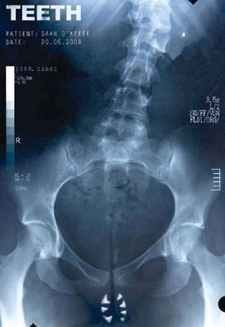
#10) Teeth
I get why the MPAA thought children would be confused and uncomfortable with this anatomically bizarre Teeth poster, but the great thing about it is how clearly it lets fans know whether or not they can handle the movie. If you can look at that poster and think, "Yeah, I want to go on this journey", then you’re going to have a great time. If you look at it and can’t stop thinking about how terrifying those vaginal teeth are, then it’s best to stay away.
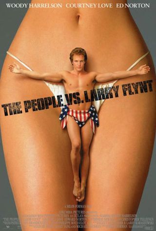
#9) The People Vs Larry Flynt
If nothing else, this poster should make everyone fall in love with Woody Harrelson. That dude goes for it. There’s almost no situation you could put him in where he would be unwilling to put it all on the line for the character. He’s awesome in The People vs Larry Flynt, and he’s damn good in this poster as a scantily clad anti-hero who spends his days wrapped in the American flag and getting up close and personal with mystery vaginas.
CINEMABLEND NEWSLETTER
Your Daily Blend of Entertainment News

#8) Sin City 2
It was a little bit silly to ban this poster, especially considering the fix was just to turn down the volume on the see-through nipple action a little bit, but that’s just where we’re at in America. Regardless, I think we can all admit what’s happening here, nipple or not, is pretty hot. Something tells me that’s exactly what the marketing team was going for. Well, that and perhaps a little bit of controversy. Nothing gathers a crowd quicker than the phrase "excessive nudity".
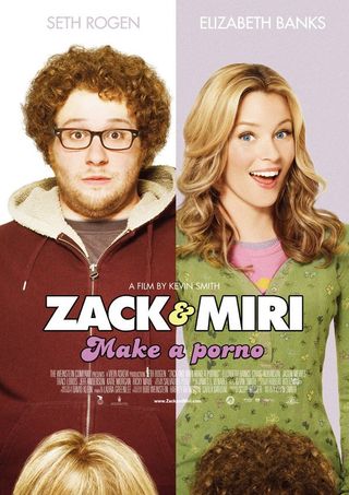
#7) Zack And Miri Make A Porno
The great thing about this poster is how safe for work it is. In fact, I’ll come right and say it was BS this got banned. Anyone who shouldn’t know what’s going on in this poster, isn’t going to know what’s going on, and anyone who can figure out what’s happening is old enough to not be scarred by the implication of oral sex. Besides, there’s exactly the right level of head here in which a casual glance might not even register what’s going on. I love it. And that pun WAS intended.
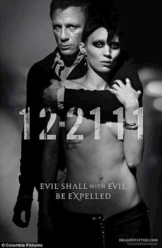
#6) The Girl With The Dragon Tattoo
I love the complicated use of letters/ numbers and shading in order to keep this poster from being WAY over the line, but in all honesty, there’s no way this ever would have made it in the United States. We’re not even comfortable with the hint of Eva Green’s nipples in Sin City 2. Hint of nipple rings? No way. Absolutely not, lest we wind up with a line of ten-year-old boys at every theater in the country pretending to not look, while obsessively walking past the poster over and over again.

#5) Saw II
There are a ton of gross-out horror posters, and most of them don’t impress me. I’m just not a huge fan of slapping gross crap on some marketing material and trying to ruin everyone’s afternoons. This Saw 2 poster, however, has some art to it. The severed fingers are used in a clever way, and it’s not knee-jerk terrifying. It’s only gross when you examine it closely and realize the digits aren’t protruding out of the snow. They’ve been full-on chopped off, probably by Jigsaw. Or former MPAA head Jack Valenti.

#4) Shame
No one wants to look at semen. I realize there are all sorts of people into some weird shit, but I’m not even sure looking at ejaculated semen is a fetish anyone has. It’s creepy, weird, uncomfortable and in no way appropriate for children. That being said, I love the creativity here. These people probably thought, since it was under the table graphic, that they could get away with it. No dice. You can use pretty much any font you want to write Shame. Times New Roman. Even Comic Sans. But ejaculate just doesn’t work, probably since it's not a real font.

#3) Thirst
The best thing about this poster is how utterly confusing it is. Where does he end and she begin? Is she wiggling between his legs? If so, why isn’t his torso longer? Also, is he into this choking as some kind of weird sex play or is he about to die? His eyes certainly don’t look good, but that might just be an unusual O-face. Regardless, you can definitely tell this poster was made by the type of genuine weirdo who would be capable of something as cool as Stoker.
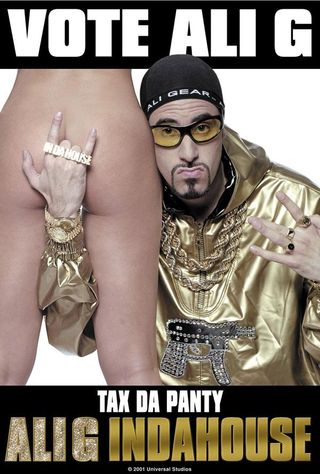
#2) Ali G Indahouse
This poster is utterly tasteless. It’s the type of thing a middle school boy would fantasize about. It’s cleverly edited in such a way that it’s not graphic, but its implication is somehow even dirtier. It’s like she’s being used for his own benefit. Thus, it’s perfect for the Ali G Movie, which is all about one douche bag’s dream of doing douche bag things. Obviously, Sasha Baron Cohen would go on to do bigger and more successful things, but thankfully, he didn’t lose his ability to offend.
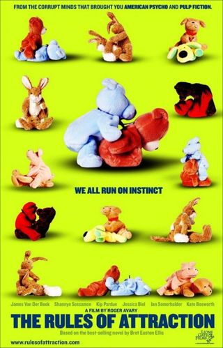
#1) Rules Of Attraction
You don’t need severed fingers to cause a scene. You don’t need nipples either. Instead, as this poster proves, you only need a willingness to go shocking places others won’t. In this case, that’s done by taking some loveable stuffed animals and dropping them in as many sexually graphic positions as possible. It’s knee-jerk funny, incredibly sophomoric and completely perfect for the movie it’s advertising. That’s why this Rules Of Attraction artwork is the greatest banned movie poster ever.
Mack Rawden is the Editor-In-Chief of CinemaBlend. He first started working at the publication as a writer back in 2007 and has held various jobs at the site in the time since including Managing Editor, Pop Culture Editor and Staff Writer. He now splits his time between working on CinemaBlend’s user experience, helping to plan the site’s editorial direction and writing passionate articles about niche entertainment topics he’s into. He graduated from Indiana University with a degree in English (go Hoosiers!) and has been interviewed and quoted in a variety of publications including Digiday. Enthusiastic about Clue, case-of-the-week mysteries, a great wrestling promo and cookies at Disney World. Less enthusiastic about the pricing structure of cable, loud noises and Tuesdays.
Most Popular


