Gran Turismo 6 Vs Forza 4: Graphics Comparison Video

Sony and Polyphony Digital recently released Gran Turismo 6 for the PlayStation 3 earlier in the month. It's presumably the final game from Polyphony for the PS3 before heading upward and onward toward the PlayStation 4. Their simulated swansong for the PS3 gets compared to the Xbox 360 version of Forza Motorsport 4 and it doesn't look good for Gran Turismo 6.
The video comparison comes courtesy of MotoGames TV, and those of you with Xbox Ones could also chime in and watch it, too, but you would have to pay to use YouTube in order to do so. Anyway, the graphics breakdown doesn't require any technical bullet points or red circle marks to point out the differences, but they're there regardless.
One of the obvious differences is that Gran Turismo 6 obviously has better use of more realized refraction from reflective surfaces, but Forza Motorsport 4 has cleaner reflections, meaning it has higher resolution reflective passes. You can actually see this in action when the Viper goes to pass under Yokohama sign and it's very cleanly and clearly displayed on the hood of the car.
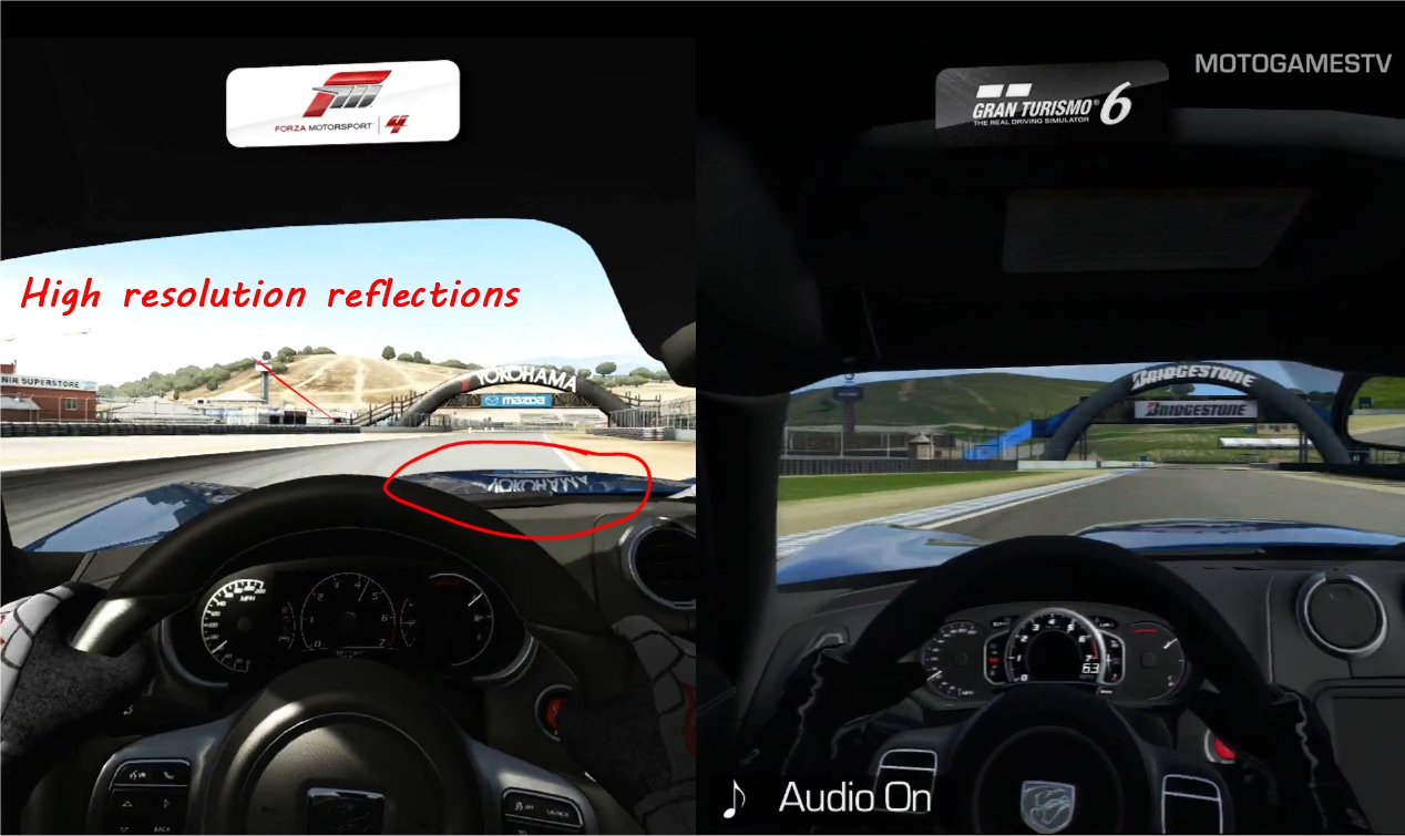
Also, take note that despite Gran Turismo 6 utilizing specular lighting on the track, it doesn't have a lot of other details going on for it. There's a giant sort of white blob littering the edges of the track's surface to emanate the sunlight, but I think they needed more texture details to help it pop. As you can see in the screenshot below, it just kind of looks plain and distracting as opposed to helping bring the environment to life.
Although, I should note that Gran Turismo's environmental lighting probably took a hit to support the day-to-night shift, which would explain the crayon-style use of lighting across the track.
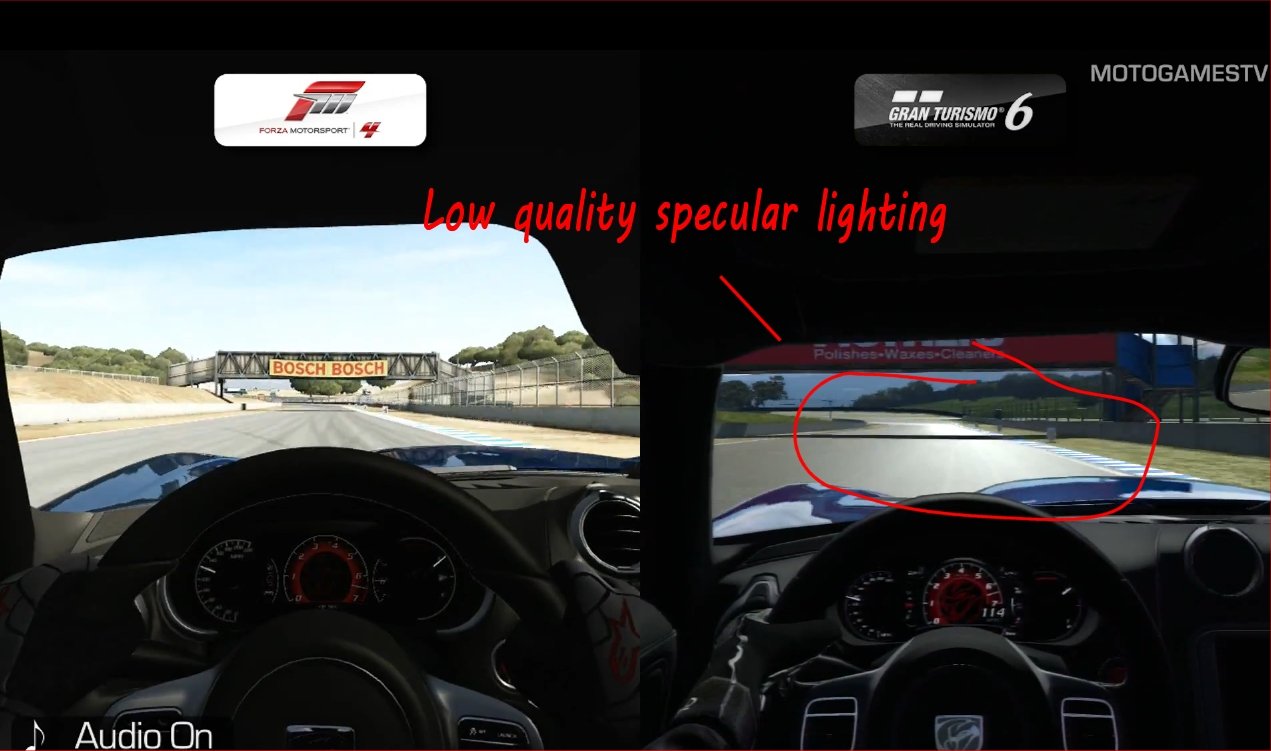
Finally, we see something that cannot be denied or brushed under the rug like a Presidential scandal involving oral coitus with an intern. The background environment.
Forza Motorsport 4 sports a very texture-rich and extremely detailed atmosphere surrounding the track. As you'll notice in the screenshot below, Forza 4's environments look healthy, vibrant and alive. Gran Turismo 6 on the other hand looks drab, boring, dull and very much like it reflects the general weather atmosphere of Britain.
CINEMABLEND NEWSLETTER
Your Daily Blend of Entertainment News
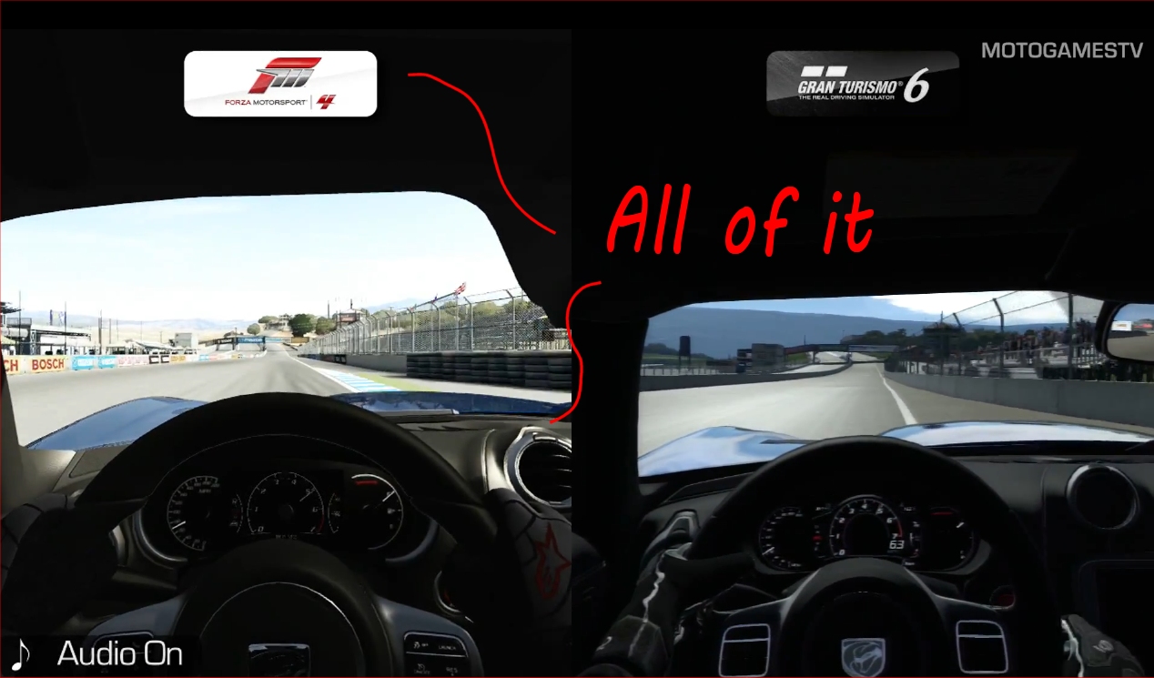
Basically, Gran Turismo 6 has lost in all its graphical comparisons, from Forza 5 to Project CARS, and even against its own predecessor, Gran Turismo 5. The game took a major overhaul for the worst, and it seems a little baffling why Polyphony didn't just hold off and put the darn thing on the PS4.
I mean, would you rather cash in on quick sales and leave behind a sordid legacy or would you rather get smaller sales at the start but leave a strong tail-end behind you with an incomparably grand legacy? I guess we all know which choice Polyphony made.
Staff Writer at CinemaBlend.
90 Day Fiancé: Matt's Latest Comments About The Throuple Situation Have Me Scratching My Head
Suits LA’s Harvey Specter Arc Wrapped Up, And It Came With Some Big Reveals About What’s Happened To Him Since The Original Series Ended
Sinners Review: I Don't Know If I Love It More As A Crime Movie Or A Horror Movie. That's Awesome


