InFamous: Second Son Screenshot Comparison Proves It Wasn't Downgraded
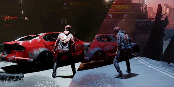
Uh oh, what happens when a specific group of fanboys lose fuel to maintain a certain argument against a platform they don't like? That gasoline turns into salt water.
Gearnuke decided to finally put to rest the claims of inFamous: Second Son being downgraded by actually comparing the game's graphics at different times of the day and snapping screenshots. Now, the shots aren't up-close and personal like the ones DualShockers handed out, but they do offer the kind of information necessary to certify that the shadows and lighting are still intact the way they were at E3.
So in case you missed it before (and I don't know how you did), a screenshot comparison showed differences enough to get some of the gaming community to rally cry that inFamous was suffering from The Forzaning. We all know what that means, right? Just click the link and be educated about... The Forzaning.
Anyway, Gearnuke's comparison of the game's different lighting scenarios based on the time of day (dusk and evening) reveals that the game is still the same as it was before. Check it out below.
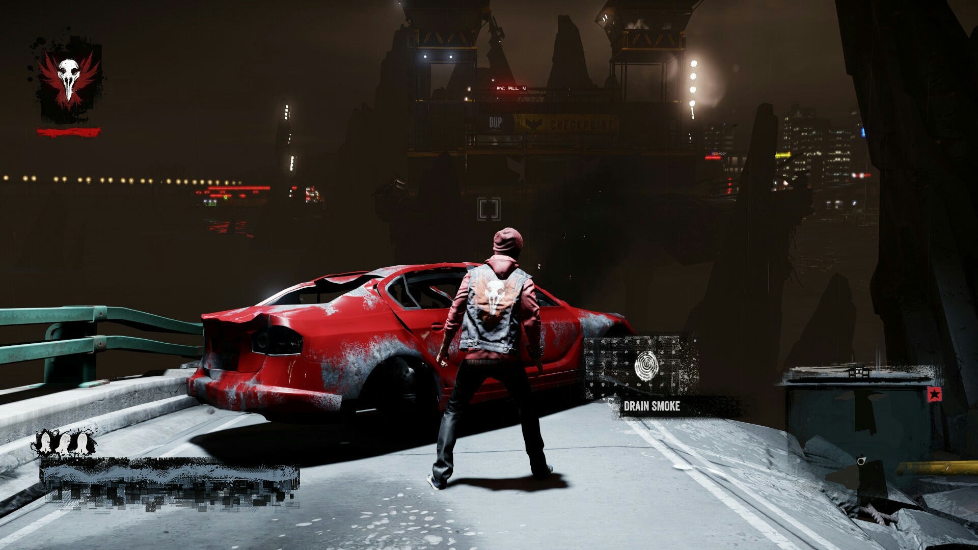
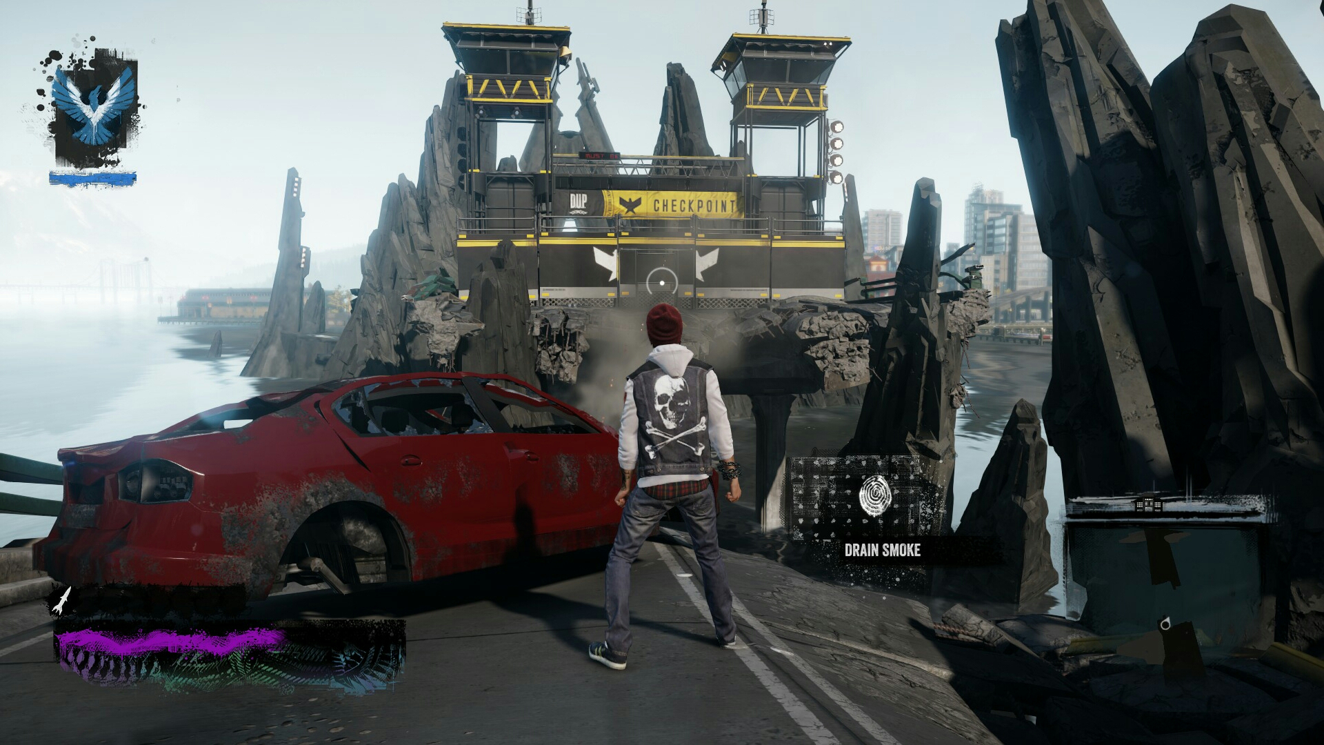
Now the biggest complaint about the graphical difference between the March build and the E3 build was the lighting and shadows “They've been removed! The shadows have been removed!” the fanboys cried.
No, they have not been removed.
Lead art technician Jason Connell from Sucker Punch Studios had previous explained that there are obviously going to be different variances of shadow density and light reflection based on the times of day and the positions of objects rendered with physical based lighting.
CINEMABLEND NEWSLETTER
Your Daily Blend of Entertainment News
As you see in the images above, the night time casts dynamic shadows of a darker contrast, which becomes evident on the crinkles in his jacket and the fact that a light directly overhead casts direct shadows over his legs. Real-time lighting for the win. You see similar shadows casts on Delsin's face given the position of the light sources in the image below, as opposed to the softer light tones from autumn hues in the bottom image.
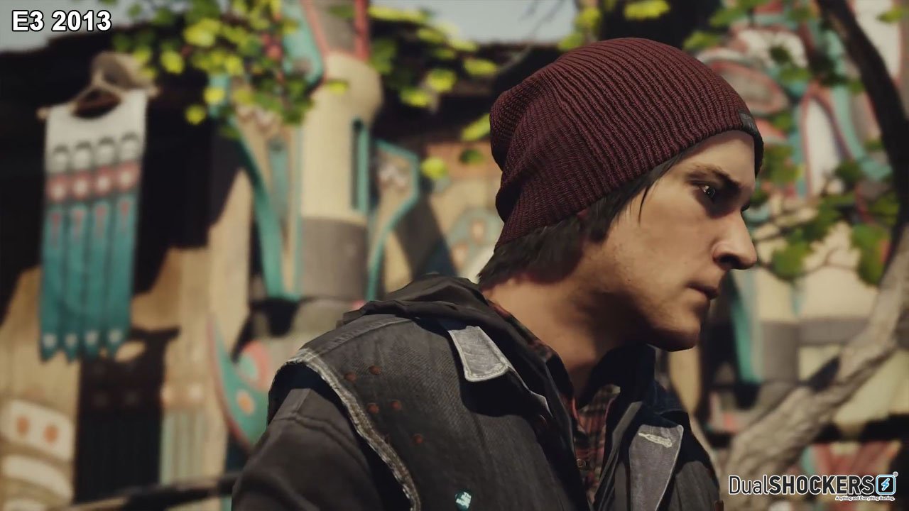
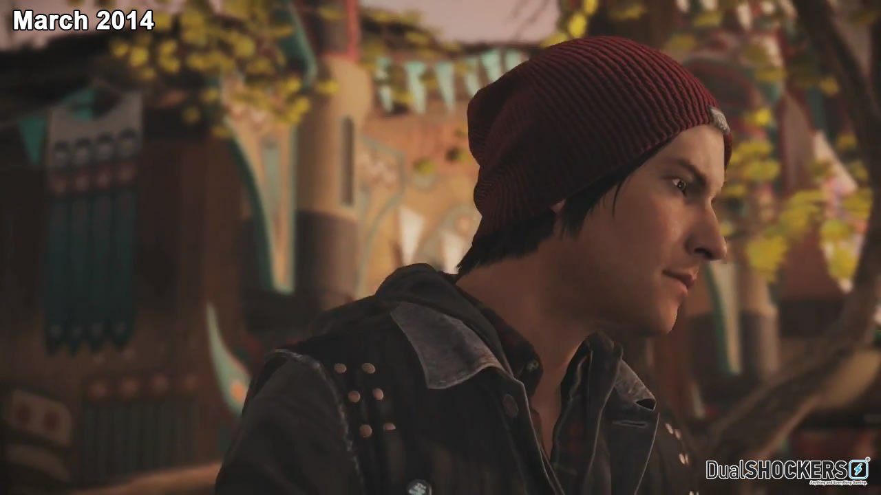
Also, as Connell mentioned, the physical based directional lighting affects where shadows are casts on Delsin, so even during the times of day where the sun is setting, you can see that the positioning of the light source projects the shadow maps in different places on Delsin's body, even different to those from the image above. Check it out.
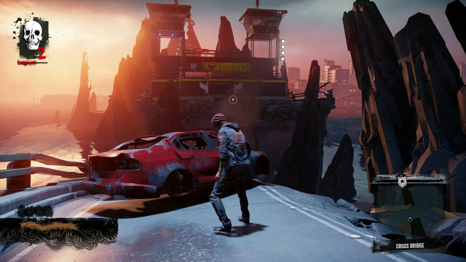
As much as the Microsoft Defense Force would love to say that the graphics in inFamous: Second Son have been subjected to a Forzaning, sadly it doesn't quite look like the case, especially if you have to literally question if there is a difference between the elements in the images. Just like with Watch Dogs and the latest “Welcome to Chicago” trailer, if you can't easily pinpoint the downgrades (or if it doesn't appear to have been downgraded at all) then it's nothing worth sweating over.
Now this isn't to say that inFamous: Second Son is some amazing looking graphical beast, but it does manage to say that the retail release keeps very close parity to what was showcased at E3.
Staff Writer at CinemaBlend.
After The Next Golden Bachelor Was Revealed, Joan Vassos Shared Some Cheeky Thoughts On Him
After I Heard Law And Order’s Hugh Dancy Quote SVU’s Iconic Opening, I Love His Take On 'Betrayal Of The Position’ After The Crossover
Olivia Wilde's Don't Worry Darling Follow-Up Is Apparently About 'Unexplored Sexuality', And The Cast Is A+ List


