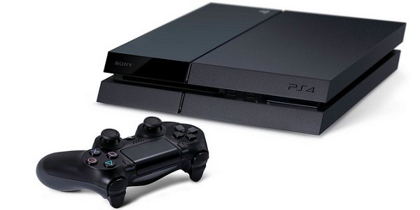
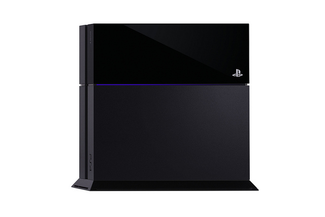
Sony got a lot of flack for not showing off the PS4 itself during the February reveal. Today they finally satisfied the masses at E3 by revealing the next-gen console's sleek chassis.
I'm used to the launch versions of consoles being a bit blocky but this thing is really sexy. It's thin and black with slanted edges. Wikipedia tells me that it's a Parallelepiped.
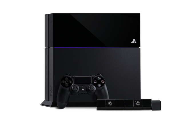
There are a lot of little touches I appreciate about the design. The permanent abandonment of that old Spider-Man font is nice. I also like the little blue racing stripe in the middle. Sort of reminds me of my old PS2.
Appearance is low on the list of reasons to prefer one console or another. However, I'm sure glad that the PS4 isn't as ugly as some of the mock-ups that were floating around the web over the past couple years.

CINEMABLEND NEWSLETTER
Your Daily Blend of Entertainment News
Staff Writer at CinemaBlend.
One Of Harrison Ford's Best Movies Came Out 40 Years Ago, And No One Talks About It Anymore
WWE Fans Are Not Happy Campers About One Match Being Left Off The WrestleMania 41 Card, And I Couldn’t Agree More
I Expected Sinners' 4DX Version To Impress Me With One Michael B. Jordan Scene, But I Got So Much More


