To 3D Or Not To 3D: Buy The Right Hugo Ticket
When we first started writing the To 3D or Not To 3D column, it was in the wake of Avatar, when it really did seem possible that the hokey old technology could be updated to not just make movies more expensive, but better. Unfortunately our first To 3D article was not about Avatar but Clash of the Titans, still the most egregious example of cheap post-conversion 3D being used to make a quick buck and actually damage the film in question. Since then 3D movies have been hit or miss, some succeeding and some making our eyes bleed, but there's yet to be a real game-changer on the level of Avatar that makes a movie not just good in 3D, but necessary.
Until now. With one of cinema's great living masters, Martin Scorsese, using the 3D format for the first time, Hugo promises to be another leap forward for the format-- it's no coincidence that James Cameron has been publicly championing it. But is the 3D in Hugo enough to just please the 3D geeks, or actually be worth your extra ticket dollars? Find out below in our latest installment of To 3D or Not To 3D.
Does It Fit?
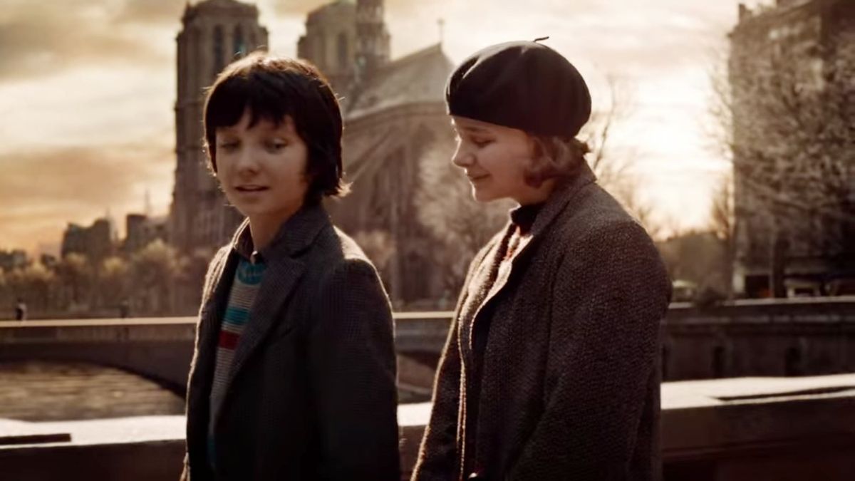
It might not sound like the adaptation of a children's book is a natural fit for 3D, but Hugo is set within the spectacular confines of a Paris train station in the 1930s, chock full of opportunities for deep focus shots, crowds of people moving in and out of various planes, and of course trains rushing into the station. Then there's the fact that our hero Hugo is responsible for winding the clocks in the station, climbing up enormous clocktowers and dodging gears and chimes in his home behind the wall. Another director could have adapted Hugo as a visual snore, but in Scorsese's hands it's a marvel of depth and gorgeously staged shots, all of them designed to pop perfectly in 3D.
Fit Score: 5/5
Planning & Effort
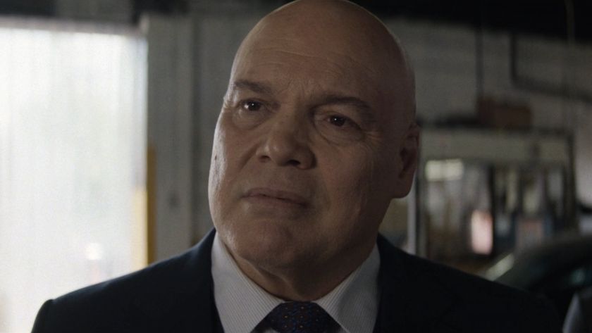
We're talking about Martin Scorsese, a man who doesn't do things halfway. While he didn't invent his own camera technology the way James Cameron did, he did pretty much everything else, from hiring special 3D technicians to help perfect every shot to, if you ask me, hiring Sacha Baron Cohen because he has a face that pops out in 3D. Everything in Hugo, from the sets to the costumes to the emotional punch in the finale, speaks of delicate craftsmanship and utmost care. The 3D is no exception.
P&E Score: 5/5
Before the Window
CINEMABLEND NEWSLETTER
Your Daily Blend of Entertainment News
This category is becoming tougher and tougher to quantify as 3D movies change, most of the moving away from the gimmicky method of tossing everything at the screen to pop out at you-- you know, "before" the window of the movie screen. But as much as Hugo is the opposite of gimmicky, it pulls this off in really subtle ways, most noticeably by tossing dust, smoke and fog into the air so that it kind drifts out at you, as if the world of 1930s Paris was reaching out to bring you inside it. And then there's the aforementioned Sacha Baron Cohen, who in one closeup shot leans further and further out so that, without ever looking into the camera, he seems to be intimidating the audience right along with little Hugo Cabret. It's extremely effective, and a really innovative way of bringing the movie before the window without relying on cheap tricks.
Before the Window Score: 5/5
Beyond the Window
Hugo is fairly good at making things pop outside of the frame, but it's in providing that sense of depth, giving the illusion that you're looking into a real 3D world, that the movie truly shines. The camera follows Hugo up the dizzying flights of stairs to lead him to the top of the clock tower, and we feel those gears and mechanisms spilling out in the distance. A Doberman chases Hugo through the train station, and every thing in that station feels vibrant even as the camera rushes away from it. Every shot of the film seems carefully calibrated to have multiple planes going on at once, and with the train station setting, there's plenty of opportunity to make every one of those planes interesting. Look for one shot in which Hugo stands outside in the snow at the home of Chloe Moretz's Isabelle, and you see the snowy street, the sky ahead, the city skyline, and then a train rushing by on an elevated track. It's like a pop-up book made real.
Beyond the Window Score: 5/5
Brightness
Theoretically it's still a problem to watch a 3D movie glasses on, given that you're effectively putting on sunglasses and automatically making everything on the screen dimmer. But Hugo compensates for the dimness with gorgeous vibrant colors in the sets, costumes and lighting, even allowing scenes at night or in Hugo's dusty attic apartment to look exactly as Scorsese intended. It's actually impressive to see a live-action film that's not set in some cartoony bright world-- think Alice in Wonderland-- that manages to stay so bright while looking perfectly authentic.
Brightness Score: 5/5
The Glasses Off Test
Usually when I'm seeing a 3D movie and know I have to write about it, I'll perform what we call the Glasses Off Test, when you remove your 3D glasses and see how blurry it makes the image. The blurrier the image, the more an object will pop out in 3D-- and thus, the more the 3D is actually used. I admit, I didn't remember to do this very often in Hugo-- for the most part i was too swept up in the story. But when I finally remembered near the end, I was rewarded with a shot of Ben Kingsley's face that practically had me seeing double-- that's how far apart they were, and how much it resulted in a 3D effect when I put the glasses back on. Granted, my sample size isn't that big, but I think the fact that I couldn't even remember to try this test surely must say a lot more.
Glasses Off Test: 5/5
Audience Health
When 3D is used poorly, and especially when it's post-converted, the action can move so fast that your eye can't follow it in both dimensions, and it can make you sense. Using expertly crafted 3D Hugo doesn't have this problem, but it does play with the idea of making the audience feel a little bit nervous thanks to new technology. Near the end of the film it revisits what happened the first time an audience was ever shown a movie, in the late 1890s when the Lumiere Brothers brought their projector to a fair, and showed the assembled crowd a single take of a train coming into a station. Having never seen a film before, the audience was terrified the train was going to hit them. Obviously we think of this reaction as silly now, but then near the end of the movie, Scorsese recreates that iconic shot of the train carving in the station-- this time in 3D. It's not just a brilliant mashup of technological marvels old and new, but a deliberate effort to make the audience a little unnerved, all to recreate what it was like to be those Parisians who saw film for the very first time.
Health Score: 5/5
| SCORES RECAP | |
| 3D Fit | 5 |
| P&E | 5 |
| Before The Window | 5 |
| Beyond The Window | 5 |
| Brightness | 5 |
| The Glasses Off Test | 5 |
| Audience Health | 5 |
| Total Score | 35 (out of a possible 35) |
Final Verdict: This is the only perfect score I've given in To 3D or Not To 3D, and I don't imagine I'll be giving another one any time soon. The 3D in Hugo isn't just masterfully executed, and it doesn't just enhance every beautiful shot in the film. It's integral to understanding the film, the way it hearkens back to the earliest days of cinema, the way it talks about magic tricks and new technology as new ways of telling cinematic stories. Martin Scorsese probably understands movies better than anyone on earth, and he's proven that 3D can be as important as color or CGI. You owe it to yourself to see how well he proves it.
This poll is no longer available.
For more 3D analysis, visit our To 3D Or Not To 3D archive right here.
Staff Writer at CinemaBlend

