To 3D Or Not To 3D: Buy The Right Monsters University Ticket
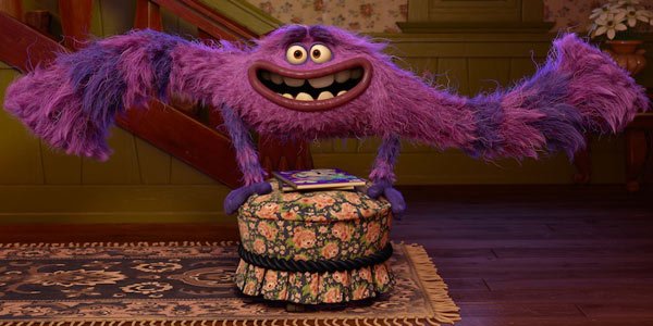
Pixar has been releasing all of their films in 3D for the last few years, and nearly every time they do it perfectly. But hey, every streak must come to an end (how else can you explain Cars 2)? So even though Monsters University is earning positive reviews in advance of its release this weekend, it's still fair to ask: is the extra cost for the 3D ticket worth it?
That's what we're here to answer in the latest installment of To 3D or Not To 3D, in which we break down a film's 3D effects into separate components and help you decide which ticket is worth the cash. Join us below as we dig into the third dimension of Pixar, and vote in the poll at the bottom to let us know how you'll be seeing it this weekend.
Does 3D Fit?
?The only guarantee in this wild world of 3D films is that animated movies are always going to be a 3D slam dunk. Not every animated film takes advantage of the format perfectly-- just look at Pixar's own Brave from last summer-- but big animated films like this are always a good place to start to convert a potential 3D skeptic.
Fit Score: 5/5
Planning & Effort?
?Every Pixar movie since Up has been released in 3D, so there's no way that director Dan Scanlon and his team weren't planning for 3D from the moment they started rendering the actual animation. And given how populated the world of Monsters University is, centered around campus positively crawling with monsters of all sizes, they were careful to take advantage of the 3D to make this world feel even more massive. Pixar's full of a bunch of perfectionists, and it's clear a lot of Type A personalities went into making this 3D happen.
Planning & Effort Score: 5/5
Before the Window?
CINEMABLEND NEWSLETTER
Your Daily Blend of Entertainment News
?The "before the window" category of 3D is one that's all too often ignored in live-action films, where they're afraid that objects popping out of the screen at the audience might be too goof. Animated films have no problem taking advantage of it, and Monsters University gets in a few great 3D gags-- including, of course, some monsters jumping out at us in the middle of a scare. They probably could have gone further with it-- this is a movie all about startling children, after all, so why not really go for it?-- but credit for going for it at all.
Before the Window Score: 4/5
Beyond the Window
?Usually you think of the best "beyond the window" films as being big epics, with armies charging at each other across a battlefield or wide, sweeping vistas. Monsters University takes place entirely on a college campus, but it really takes advantage of the depth of the screen in the many scenes that are completely crammed with monsters. The animation team clearly went to great lengths to make each character's design different, and the 3D really allows you to see all that clearly. When the film moves into some action sequences, like a big footrace around a bunch of booby traps, the 3D ramps up the race's tension-- you can really feel that rival team gaining on Mike and Sulley. The world of Monsters University is big and vibrant, and the 3D goes a long way to make it feel even bigger.
Beyond the Window Score: 5/5
Brightness
?Animated films are typically great at compensating for the dimming effect of 3D glasses, since most of them are crammed with brightly colored characters and scenes to appeal to those kid audiences. Monsters University might be the brightest animated film in years, and the carefully wrought colors and furs and scales of all the monsters have no trouble popping just as well with the 3D glasses between your eyes and the screen. Like I said, these guys are Type-A perfectionists. They weren't about to let the 3D glasses block our view of their creations.
Brightness Score: 5/5
The Glasses Off Test
?The glasses off test is a pretty good way to judge the intensity of a given movie's 3D-- the mo blur you see when you remove your glasses, the more the 3D image is likely to pop when you put them back on. As a movie expecting a lot of children in the audience, Monsters University probably doesn't want to go too intense on the 3D, so while some moments feature plenty of blur-- like that aforementioned race scene-- many of the quieter ones are almost completely flat. That doesn't mean it's a waste of 3D, but it's not as impressive as something like Oz The Great And Powerful either.
Glasses Off Score: 3/5
Audience Health?
Sometimes 3D movies apply the technology so poorly that the audience will get seasick just trying to keep up with it. Monsters University, with kid audiences in mind and a lot of smart people behind it, does not fall into that trap. You'll be just fine.
Audience Health Score: 5/5
| SCORES RECAP | |
| 3D Fit | 5 |
| P&E | 5 |
| Before The Window | 4 |
| Beyond The Window | 5 |
| Brightness | 5 |
| The Glasses Off Test | 3 |
| Audience Health | 5 |
| Total Score | 32 (out of a possible 35) |
Final Verdict: I was surprised to see this score come out so high, since there was no single moment of Monsters University that leapt out and proclaimed itself as spectacular 3D. But this is exactly the kind of film and story that's best-suited to the format, and Pixar knows exactly how to take advantage of it, without going so crazy with the technology that they confuse or alienate kids. You won't miss anything crucial by sitting out Monsters University in 3D-- but if you want to see one more example of Pixar doing things with precision and skill, you can feel just fine shelling out the extra cash.
This poll is no longer available.
Staff Writer at CinemaBlend


