To 3D Or Not To 3D: Buy The Right R.I.P.D. Ticket
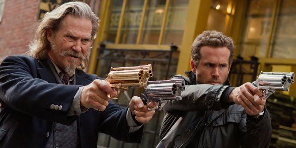
This weekend has a crowded release schedule with James Wan’s lauded latest The Conjuring facing off against DreamWorks snail-racing adventure Turbo, the star-stuffed Red 2, and the bonkers action-comedy R.I.P.D. Starring Ryan Reynolds and Jeff Bridges, this high concept venture follows an odd couple of dead cops charged with hunting down runaway souls, as is their duty as reluctant members of the Rest in Peace Department.
If the trailer that plays like a mix of Dead Like Me and Men in Black turned your head, you’re likely wondering if this weird feature has 3D worthy of a pricier ticket. Well, that’s what we’re here for. You can read our review of the film here, but refer to the following guide to see how R.I.P.D.’s 3D stacks up.
Does It Fit?
Set in a world where damned souls linger on Earth to become monsters and wreak havoc on the living, R.I.P.D is stocked with fast-paced action set pieces that tear through the streets of Boston. These sequences give opportunity for some standout 3D, and the setting—with its long streets and towering buildings—provides a solid platform for 3D’s added dimension. Plus, with so much of the film’s look reliant on CGI, it seems like it would be easy enough for the 3D engineers to differentiate planes of action. Between the adventure, the setting, and the various action set pieces, R.I.P.D seems a great fit for 3D.
Fit Score: 5/5
Planning & Effort
Sadly, the decision to go 3D was one made late. Rather than being shot in 3D or with 3D in mind, R.I.P.D was post-converted into 3D, a decision that was made five months before it was to open and one month after shooting wrapped. The good news is that all the aforementioned CGI and various green screen setups made the transition to 3D pretty smooth. However, as the film’s cinematography was not planned with 3D in mind, there are some setups that don’t mix well with the format. Basically anytime director of photography Alwin H. Kuchler opts to put a foreground element out of focus, or anytime a lens flare is used, it's jarring. Likewise, the use of swish-pans are a bit dizzying in 3D.
Planning & Effort Score: 3/5
Before the Window
CINEMABLEND NEWSLETTER
Your Daily Blend of Entertainment News
This category is essentially for those elements that seem to pop out into the theater. It's also the category in which post-converted movies tend to score lowest. Typically, to get this attribute of 3D to really sing, you have to block and stage a given scene for 3D cameras with 3D in mind. Otherwise, there's little that can be impressively pulled out in post. To R.I.P.D's makers credit, they did manage to find small moments when wisps or computer generated smoke or dust or what-have-you protrude a bit. But that’s all that I noticed.
Before the Window Score: 2/5
Beyond the Window
This is where R.I.P.D’s 3D performed the best. The 3D gave a greater depth of field to the Boston-set fight scenes whether the camera raced down the streets or swiveled up to take in the action playing out on the sides of skyscrapers. The 3D also made the halls of Rest in Peace Department Boston headquarters feel more cavernous. But most noteworthy in this category were the planes created in the final fight scene. It seems great care was taken in creating a depth of field that gave an added weight to characters' actions, whether Bridge's cowboy lawman was covering his partner with some pivotal sharp shooting, or Reynolds' rookie was rushing to save his damsel in distress. Nothing outstanding is done with the 3D, but it definitely added a boost to the action.
Beyond the Window Score: 3/5
Brightness
3D can be great. But if the studio doesn’t adjust the color correct a few notches brighter to compensate for the dimming effect of 3D glasses, their efforts elsewhere are wasted. Thankfully, Universal Pictures didn’t make that mistake. All of R.I.P.D.'s key action sequences are well lit, so 3D won’t make you miss a thing.
Brightness Score: 5/5
The Glasses Off Test
This test—which as its name suggests involves removing your glasses to see the difference in viewing with and without—is a basic way to see how much 3D you’re getting for your money. With the advantages of R.I.P.D’s heavy use of CGI, there’s plenty of opportunity building in 3D layers, and the test proved Universal took advantage.
Glasses Off Score: 4/5
Audience Health
Sometimes bad 3D is more than a waste of money, it’s detrimental to your well-being, possibly triggering nausea. Post-converted 3D gets dinged here far more often than features shot for the format. But at the end of R.I.P.D I felt fine and dandy. However, I’m docking a point for the jarring elements—swish pans and foreground blurs—that made me blink furiously as my brain tried to force my eyes to refocus and reboot.
Audience Health Score: 4/5
| SCORES RECAP | |
| 3D Fit | 5 |
| P&E | 3 |
| Before The Window | 2 |
| Beyond The Window | 3 |
| Brightness | 5 |
| The Glasses Off Test | 4 |
| Audience Health | 4 |
| Total Score | 26 (out of a possible 35) |
Final Verdict: All in all, the 3D of R.I.P.D is fine. It's not the kind of post-converted garbage 3D that spurred us to begin this column. And as far as post-converted 3D goes, it's even fairly impressive. But it's not spectacular enough for me to recommend you pay for the upgraded ticket. Yes, it adds some extra oomph to the action sequences, but not enough that you'd be missing out if you choose to see it in 2D. But hey, if you want to see Jeff Bridges' magnificent mustache and beard combo in full 3D effect, I won't judge.
This poll is no longer available.
Staff writer at CinemaBlend.

