To 3D Or Not To 3D: Buy The Right Wreck-It Ralph Ticket
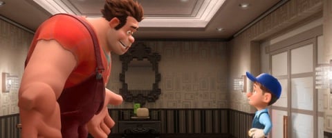
Here’s one sure-fire way to wreck your Wreck-It Ralph theatrical experience: Save a few dollars and avoid screening the vibrant animated feature in 3D.
As we’ve mentioned in past To 3D columns, digital animation traditionally lends itself to stronger conversion than a live-action filmed image. Perhaps because the visuals are rendered directly from the computers which create them, digital animation typically makes very good use of 3D technology, and Ralph is no exception. Director Rich Moore and his team make a series of decisions that contribute directly to the limitations of the 3D presentation, making Ralph one of the best 3D films I’ve seen in years. Let’s elaborate.
Does 3D Fit?
Better than you could imagine. Wreck-It Ralph essentially builds 3D storytelling into its premise by taking us through the glass screen of a traditional cabinet-style arcade game and into the virtual realm of a classic (but fictional) title. So much of what happens in Ralph involves characters inside of multiple games looking out at the arcade – and the kids playing the games – to determine if they are going to be deemed “Out of Order” and possibly unplugged. As Ralph (John C. Reilly) and his castmates contemplate their fates, Moore uses some spectacular 3D to establish his virtual world, showing us where our world ends and the video-game world begins. The sharp 3D technology actually creates a bridge between the worlds in multiple scenes. I think Ralph would really lose a crucial step if only viewed in 2D.
Fit Score: 5/5
Planning & Effort
Sort of elaborating on the points of the previous section, yes, Ralph was conceived and planned to play to 3D imagery in multiple scenes. It’s not just the initial leap into the cabinet game of Fix-It Felix Jr., which is a delightful visual trick. Every time Moore explores a new game with his wandering lead character, Ralph, the animators experiment with 3D visual imagery to lift the experience off of the screen. A first-person shooter like Hero’s Duty puts Ralph audience members on the front lines of a war against cyber-bugs. The candy-cane-colored world of Sugar Rush explodes off the screen, with limbs from candy trees dangling closer to the audience. A lot of thought went into the dsign of Ralph to untilize the 3D. It might not enhance every single set piece in the movie, but it lends a fresh new level to 90% of the visuals in the picture.
Planning & Effort Score: 4/5
Before the Window
CINEMABLEND NEWSLETTER
Your Daily Blend of Entertainment News
There’s less of this than I expected, to be honest with you, but the movie’s focus stays behind the window, which we’ll talk about next. Wreck-It Ralph doesn’t dabble in the “Look at me!” 3D that has to reach out toward a viewer and proclaim, “This is pointing at you, so the extra $3 are worth it!” Military soldier Calhoun (Jane Lynch) waves her massive gun outside of the Window every once in a while. The “Open” sign in the window of the arcade looks like it’s floating off in the corner in one establishing shot. Purple strands of Laffy Taffy sometimes look like they could be touched if you reached your hand forward. But when Moore was working on perspectives for his visuals, he often starts at the window and works deep into the scene, which makes the next section that much more amazing.
Before the Window Score: 2/5
Beyond the Window
Here’s where Wreck-It Ralph continually shines. Moore’s video-game worlds are gorgeously elaborate creations that are jam-packed with colorful, inventive eye treats that could be explored again and again on multiple viewings. The 3D element, again, puts Moore’s visuals into unconventional perspectives – often with Ralph and his lumberjack frame offset by a smaller but vibrant image – and it always works in favor of the finished film. The bulk of the movie is spent preparing for a car race through the game Sugar Rush, and when that moment arrives, Ralph morphs into a Speed Racer remake, as reimagined by Willy Wonka. But you’ll find yourself constantly scouring the backgrounds of Moore’s deep and rich environments, which always stay in crisp, clear focus … and always give us plenty to observe.
Beyond the Window Score: 5/5
Brightness
Once again, Moore is ahead of the curve. Knowing Ralph would have to contend with the shade of the 3D glasses, the director regularly saturates his imagery with artificial light to compensate. Even in scenes set in the arcade, which should be dimmer than usual, Moore shines light on Ralph or his other characters to help pull them into focus. A quick trip through Hero’s Duty doesn’t get too diminished. The rest of Ralph stays in brightly-lit, candy-colored realms that flood the screen and help the 3D elements stand out.
Brightness Score: 4/5
The Glasses Off Test
On the few times that I took my glasses off during Ralph, the images drastically dropped out of focus and the character movements became more of a blur. There was a soft-blur lining around each image, emphasizing just how sharp the 3D was in the film, and everything had that double-layered look that guarantees an instant headache if you stare at it too long. Put the glasses back on, though, and the depth and clarity of the 3D image snapped right back into place. There’s a ton of 3D mapping involved in every scene on Ralph, and that became clear during this test. One other element that bears mentioning: The brightness increased so much on the screen that the visuals threatened to be white-washed out when you removed the shaded 3D glasses. You could tell that Moore had increased his brightness to assist the 3D (and overcome the glasses), so by removing them, it damaged the overall look of the film.
Glasses Off Score: 2/5
Audience Health
Here’s where I might fall into the minority on Wreck-It Ralph. The emotional element of the screenplay (credited to three gifted writers) often gets buried under the flash and noise that can accompany an animated feature. They are aimed at kids, no doubt. But Ralph sometimes bobbed and weaved just for movement’s sake, and the hectic hurrying of the story’s pacing might have a few older audience members looking away from the screen. It’s by no means an immersive technique, and it isn’t a major problem for the film. But if we’re being honest, I can’t go much higher than a 3 on Health.
Audience Health Score: 3/5
| SCORES RECAP | |
| 3D Fit | 5 |
| P&E | 4 |
| Before The Window | 2 |
| Beyond The Window | 5 |
| Brightness | 4 |
| The Glasses Off Test | 2 |
| Audience Health | 3 |
| Total Score | 25 (out of a possible 35) |
Final Verdict: As I mentioned earlier, Wreck-It Ralph might boast some of the best 3D I’ve seen on screen in years. Rich Moore goes out of his way to fill his deep scenes with color and flashy detail. The video-game realms of Ralph are perfect for elaborate 3D creativity, and the movie does a lot with its technology (mainly because, with animation, you can). Don’t be a stink-brain. Enjoy Wreck-It Ralph in 3D, as its creators obviously intended.
This poll is no longer available.

Sean O’Connell is a journalist and CinemaBlend’s Managing Editor. Having been with the site since 2011, Sean interviewed myriad directors, actors and producers, and created ReelBlend, which he proudly cohosts with Jake Hamilton and Kevin McCarthy. And he's the author of RELEASE THE SNYDER CUT, the Spider-Man history book WITH GREAT POWER, and an upcoming book about Bruce Willis.
