4 Hideous Movie Christmas Trees You Would Never, Ever Put In Your House

I’m a total Christmas tree snob. It takes me at least an hour to wander through a Christmas tree lot and pick out the most beautiful option available. If I’m going to put something inside my home, for a month, I want it to be as visually appealing as possible. Unfortunately, not everyone has the magic touch. A high percentage of people, apparently without common sense or eyes, buy miserable-looking wobbly eyesores and then show them off like they’re displaying the Hope Diamond.
Movie characters are no exception either. An inordinate number of them seem to make horrible choices when it comes to trees, and more often than not, these barky mistakes go completely unmentioned. Well, since today is Christmas, it seems like the perfect time to take a look back and finally call out some of these families for their extremely ugly tastes.
Here are four movie Christmas trees too ugly for words…
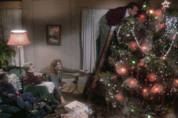
Why is this tree so fat? I think it’s wider than it is tall. Consequently, there aren’t any actual angles. It’s just one giant blob that takes up an obnoxious amount of space. It also overwhelms the ornaments, cuts off a large pathway through the room and due to its bulk, makes changing the star on top almost impossible.
Bigger is not always better. Like a human being, a tree needs to be big in the right places to be visually appealing. It can’t just add weight for the sake of adding weight. Beyond that, this particular piece of nature isn’t decorated very well either. The lights have no rhythm or flow to their placement, and there should either be more tassel or less. This middle ground is just bad news.
Home Alone 2
CINEMABLEND NEWSLETTER
Your Daily Blend of Entertainment News
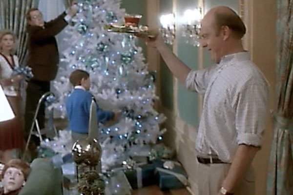
Obviously, the giant tree in Home Alone 2 is great, but the little guy the family decorates is hideous. Why does anyone bother with a white tree? I get it. Upon first glance, it looks like snow fell on top of a normal Christmas tree, but once that initial gimmick wears off, all you’re left with is an ugly white mess that distracts from the ornaments and jars the senses.
And if you are going to choose a white Christmas tree, why would you do green ornaments? If you like green, why not just buy the tree in green? And if you are going to do all of that, why continue the color scheme and wrap presents in green and white? That’s way too matchy-matchy. Even Uncle Frank could tell you sometimes switching up colors is better for the eyes, and he's objectively an idiot.
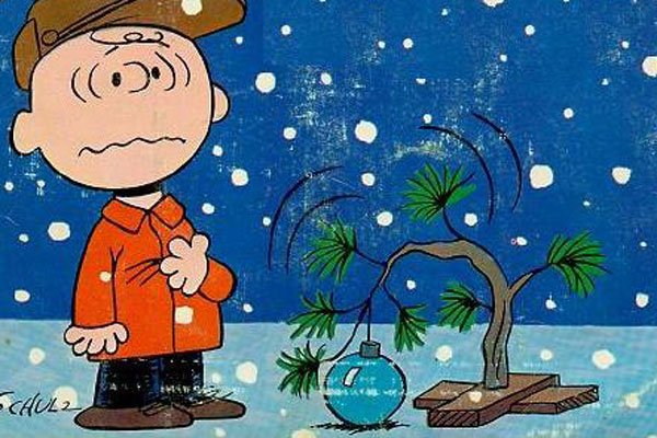
A Charlie Brown Christmas
Yes, I get that this tree helps to teach everyone a valuable lesson and it’s sort of cute in its obvious hideousness, but let’s not pretend it’s not sickly, weak and really, really sad. If this tree was inside your house, you would feel the need to apologize for it every single time someone walked in and spotted it. You would have to justify why you felt the need to ruin everyone’s buzz by displaying it.
On a more practical level, it also isn’t tall enough to offer much space below the tree for presents, and it’s not wide enough to offer much space around the outside. You would need to work out in semi-circles in order to put everything you needed under the tree, and as you can tell, it’s only somewhat capable of supporting one lonely ornament.
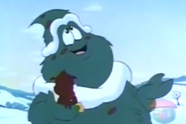
Christopher The Christmas Tree
I get the appeal of animating mouths on objects, animals and plants that normally aren’t capable of talking, but there’s a really fine line between creepy and cute. Poor Christopher definitely falls on the wrong side of it. Now and again, I’ll hear people talking about how they don’t get why Christopher The Christmas Tree never took off. Well, his appearance is a really good start. Would you really want to put that dude in your house?
It also really bothers me that he has a snow unibrow. Did he use his tree hands to position the snow that way, or did it somehow just fall in that exact configuration? Either way, I’m seeing a pretty big plot hole.
Mack Rawden is the Editor-In-Chief of CinemaBlend. He first started working at the publication as a writer back in 2007 and has held various jobs at the site in the time since including Managing Editor, Pop Culture Editor and Staff Writer. He now splits his time between working on CinemaBlend’s user experience, helping to plan the site’s editorial direction and writing passionate articles about niche entertainment topics he’s into. He graduated from Indiana University with a degree in English (go Hoosiers!) and has been interviewed and quoted in a variety of publications including Digiday. Enthusiastic about Clue, case-of-the-week mysteries, a great wrestling promo and cookies at Disney World. Less enthusiastic about the pricing structure of cable, loud noises and Tuesdays.
