Back To The Camera Posters Are The Trend For 2013
It would seem that movie-goers don’t want our stars looking us in the eye anymore. We just want it quick, dirty, and, most importantly, from behind.
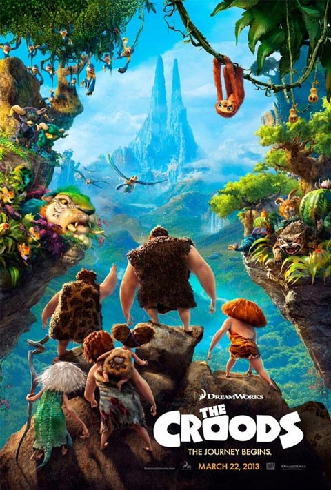
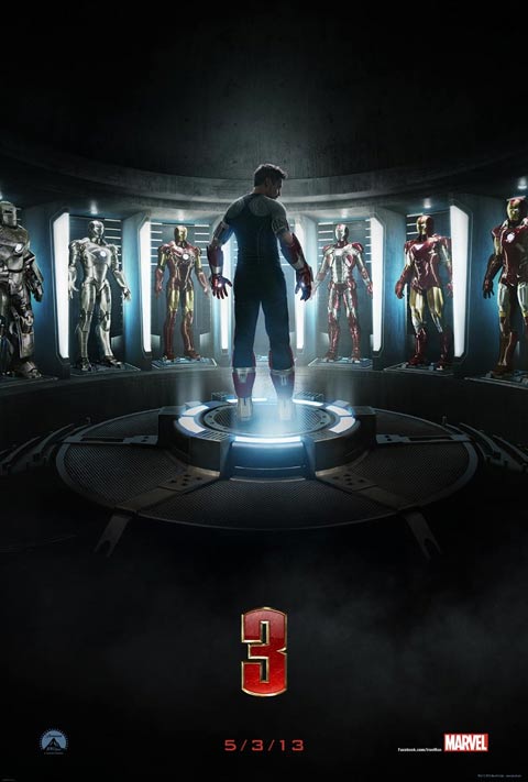
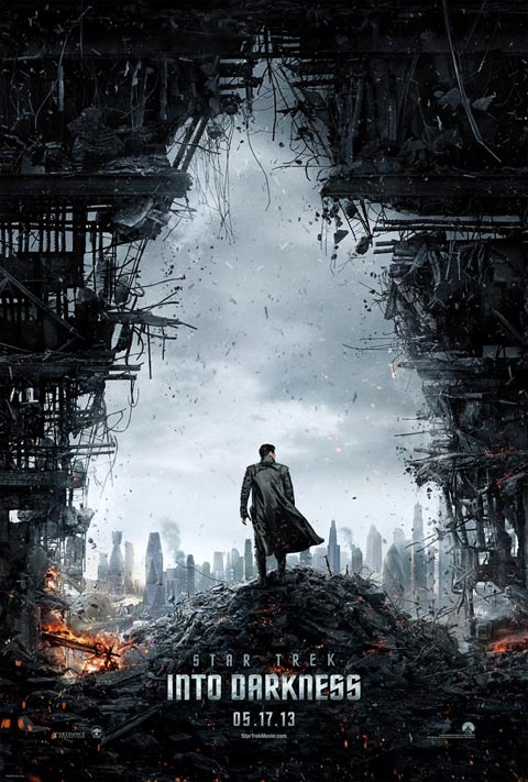
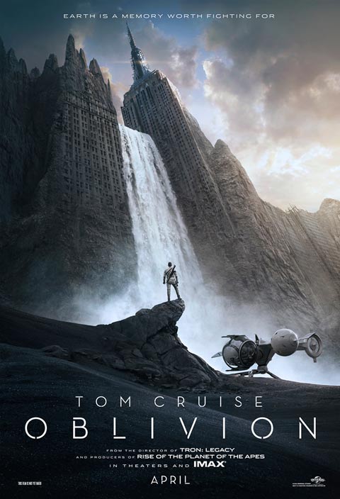
Earlier today we saw the release of the first poster for the upcoming M. Night Shyamalan-directed sci-fi thriller After Earth, but if you’ve been paying attention to the film world over the last few months you probably realized that the design is very similar to some other recently released posters for 2013 blockbusters. In fact, it almost seems that every movie that is set to debut next year is getting a different version of the same poster.
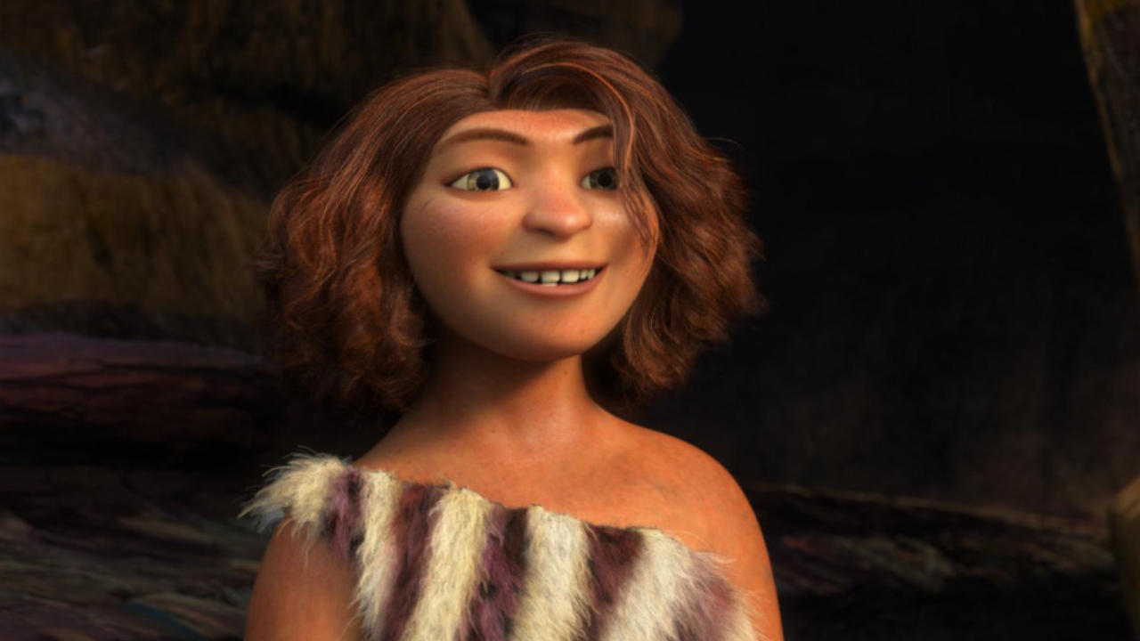
Don’t believe me? Well, let’s do some quick mental time travel all the way to late September when the folks over at Dreamworks Animation released this poster for The Croods:
About a month later Marvel Studios unveiled this piece for Iron Man 3:
Then earlier this month we got the first one-sheet for Paramount Picture’s Star Trek Into Darkness:
That was followed just four days later by Universal Pictures’ Oblivion:
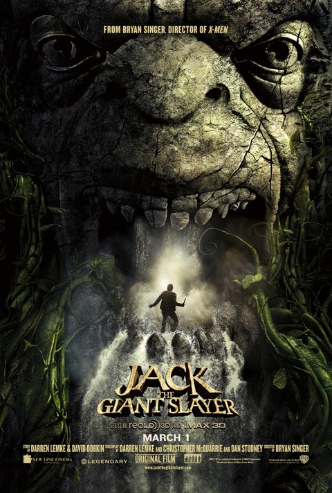
And then another four days passed and Warner Bros. Jack The Giant Slayer came out with this:
CINEMABLEND NEWSLETTER
Your Daily Blend of Entertainment News
Just to cement the point, here’s the poster for Columbia Pictures’ After Earth:
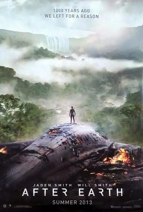
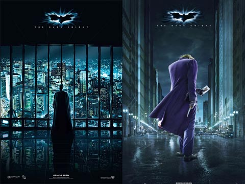
For those keeping score, that’s six practically identical 2013 movie posters from six different studios that were all released within four months of each other (and four came from December alone). Obviously I’m not naïve enough to think that this is a brand new thing. Not only have movie studios reduced the number of poster templates in general down to about 10, they’ve even been doing the behind-the-back look for a while now – and it was popularized by this pair of pieces from Christopher Nolan’s The Dark Knight:
Though it’s been happening for years now and the diminishing amount of creativity in Hollywood has been long apparent, it is now becoming a legitimate problem. It’s one thing for studios to release stupid, generic designs a couple times over the course of a year, but when they’re all released at the exact same time there is a danger of homogenization. Serious film fans may not have the problem, but is a casual movie-goer going to look at the posters for Oblivion and After Earth and know the difference? Absolutely not. They’re going to be processed mentally as the exact same thing, and how does that help either film?
What’s funny about the whole situation is that it will end up being the studios that are hurt by flooding the market with material like this. If everything looks the same people will have to decide whether they want to spend money on the same thing twice. And that’s going to hurt at the box office.
Repetitive designs like these come from excessive market research and testing, so it’s very likely that people do actually respond to the “hero’s back to the camera” poster, but marketing folks have to start pumping the brakes. Otherwise they may as well just go with pure grey backgrounds with movie titles on them.

Eric Eisenberg is the Assistant Managing Editor at CinemaBlend. After graduating Boston University and earning a bachelor’s degree in journalism, he took a part-time job as a staff writer for CinemaBlend, and after six months was offered the opportunity to move to Los Angeles and take on a newly created West Coast Editor position. Over a decade later, he's continuing to advance his interests and expertise. In addition to conducting filmmaker interviews and contributing to the news and feature content of the site, Eric also oversees the Movie Reviews section, writes the the weekend box office report (published Sundays), and is the site's resident Stephen King expert. He has two King-related columns.
The Fantastic Four: First Steps Director Thankfully Didn't Rely Solely On Motion-Capture To Bring Galactus To Life, And I Couldn’t Be Happier With This Approach
Next Summer Is Going To Be All About Tom Holland, And I Need Everyone To Start Coming Up With A Fun Spider-Man Version Of Barbenheimer Now

