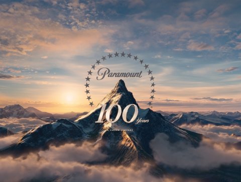
Check Out The Paramount Pictures Logo With A New Facelift

Your Daily Blend of Entertainment News
You are now subscribed
Your newsletter sign-up was successful
Technically a movie studio's logo is just marketing, plain and simple. It's the brand of a multi-billion dollar global company, designed specifically to make you buy their product, and representative of all the way in which this company exists to make money. But let's be honest-- a movie studio's logo is more than that. Coming at the beginning of a film, a studio logo can put you in the mood for what's to come next or remind you of other movies from that studio you loved. When you see the Amblin logo of Elliott riding across the moon, you remember how much you loved E.T.. When you see the Pixar lamp hopping across the screen, you settle in for another work of art from those guys. Studio logos are the first thing you see in a movie; you'd better believe they're important.
So while we normally wouldn't be reporting a logo change as news, it does seem worth mentioning that, starting with Mission: Impossible - Ghost Protocol this weekend, the Paramount logo is getting a facelift. The iconic mountain and stars are still there, of course, but it's all a little brighter and more modern-looking; in the version I saw before the critic's screening of Ghost Protocol, we zoom in on the mountain and watch the stars skim over the water in front of it. And for the next year, the logo will come with the words "100 years," celebrating the centennial anniversary of the studio. Check it out below.

The logo actually suggests even more pomp and circumstance than the old one did, which means you will be even more in the mood for spectacle-- perfect for a movie as big and bold as Ghost Protocol. Keep an eye out for it yourself at the movies this weekend.
Article continues belowYour Daily Blend of Entertainment News
Staff Writer at CinemaBlend

