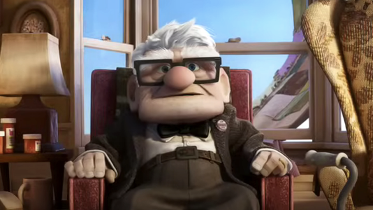
It’s still hard for me to believe that Pixar will be releasing a movie about an aging old curmudgeon in less than two weeks, but it’s happening, and even better, Up looks like it’s going to be a huge success. The trailers are gorgeous, with a color palette that’s pleasing to all of the senses, and early word on the film is better than good, with some critics going as far as calling it the best movie of the year so far. What you're probably wondering though, is how Pixar was able to create an old grump like Carl Fredrickson and still make him lovable?
You're in luck, as the New York Times is currently running a feature which covers the development of Up’s four main characters: Carl, Russell, Dug, and Kevin.
What’s most fascinating about the design in this movie is how much the shapes of the characters help to symbolize their attitudes towards the world they inhabit. The article states: “Because Carl is so set in his ways, the designers thought it would be best to represent his features in square shapes, from his face and his glasses down to his fingers and knuckles.” To contrast Carl’s square physique, Russell, whose personality is more wide-eyed and innocent, was designed to be more open and round. “He’s the young, rounded yang to Carl’s stubbornly square yin,” the article notes.
In addition to a few written words on each character, the article also contains an interactive feature that includes preliminary sketches of the characters as well as audio commentary on how the character came to be. Now I have 12 days to convince my niece how badly she wants to see this movie.
CINEMABLEND NEWSLETTER
Your Daily Blend of Entertainment News
