Movie Poster Mash-Ups Blend Together Your Favorite Blockbusters

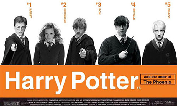
There are posters that are clever, and that know how to sell the movie they're designed for, and then there are posters that are so embarrassing even the studio doesn't want them out in the universe. The latter are the posters that don't understand the tastes of the audience and the main thrust of the film they're representing. Fan-made posters, however, like the ones you'll find above and below from Imgur , strike a balance between outlandish ideas and quality graphical content, like the example above mixing Harry Potter and the Order of the Phoenix with Trainspotting.
Behold the power of fan art : posters by the fans, for the fans. Sometimes it serves to help visualize a concept that hasn't found a look yet, and sometimes it serves to mash up two concepts that shouldn't be together. Done right, it can result in the creation of something that's visually cohesive, but at the same time amusing and not to be taken too seriously.
Two galleries of such images have come to our attention, and there are some notables pieces that are worth highlighting for their style, as well as their general humor. All of them have one thing in common: they mash up two different films to create a final product that's stranger than any film you could imagine.
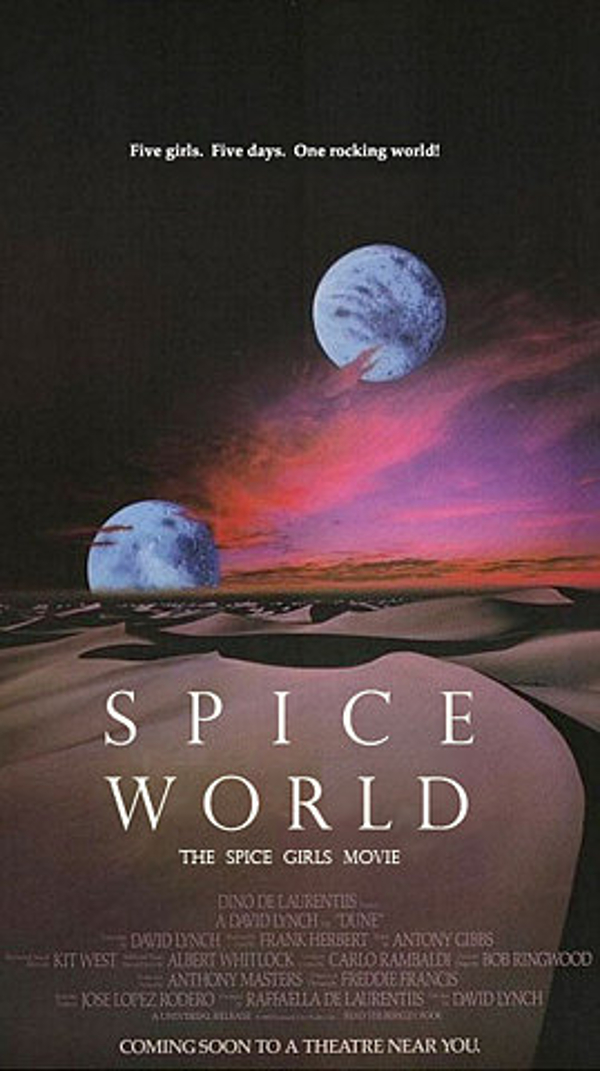
First up is this mash-up of David Lynch's legendary (if not somewhat confusing) masterpiece Dune and the Beatles-esque knockoff Spice Girls movie Spice World. With a gag like this, you can easily just drop a photo of the Spice Girls in there and call it a day. Thankfully, the artist behind this poster didn't take that easy way out and instead really gives you something to look at. They play to the concept, not the laugh, and it makes the final product more rewarding.
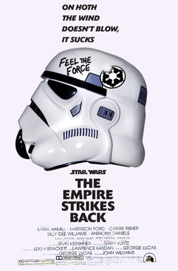
Up next is Kubrick's Full Metal Jacket mixed with Star Wars Episode V: The Empire Strikes Back. Now this asks a couple of questions that Star Wars fans probably haven't even thought of asking: who is the scarier commanding officer, R. Lee Ermey or Darth Vader? Is the Battle of Endor one big metaphor for the Vietnam War, and if it is, does that make Wicket a more family-friendly representation of the $5 dollah hooker? More seriously, I wonder what would Stanley Kubrick's version of Star Wars would have looked like. Admit it, you're laughing at the mental image the second question has inspired. Go ahead, take a moment, and move to the next image.

Going back to a more subtle sort of image, a fan threw together Fritz Lang's classic dystopian sci-fi film Metropolis with the not-so-widely remembered sequel Babe: Pig In The City. The Babe movies had an interesting mix of muted colors and cute imagery, mixed with dark and grim subject matter, which I guess is why this poster works so well. If Babe director George Miller had been completely let off of the creative leash with this movie, one can only imagine the sorts of things we could have seen. This is the man that brought us Mad Max, after all, so use your imagination.
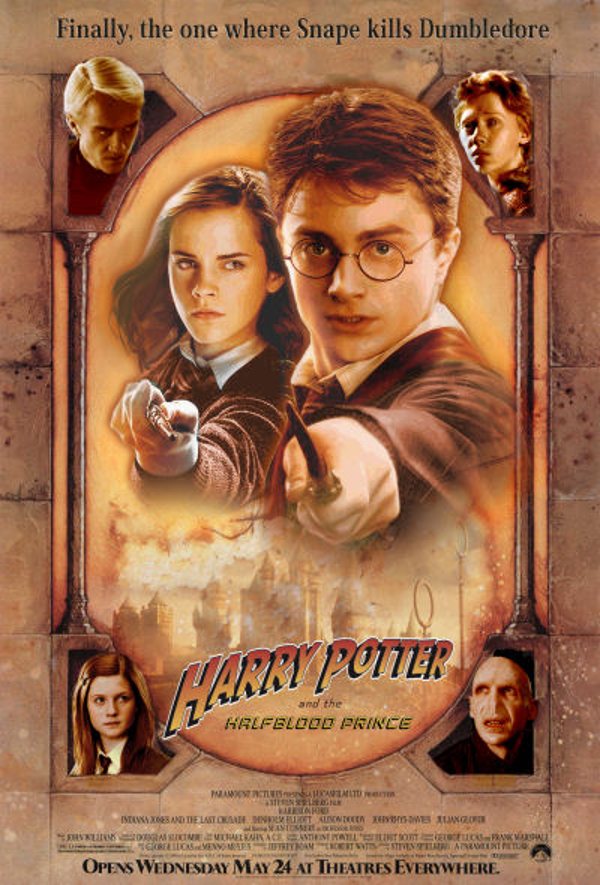
We close this rather colorful curation with two pieces celebrating the style of Steven Spielberg movie posters! The first is a re-draft of Harry Potter and The Half Blood Prince, which is interesting considering Spielberg was up for the directing gig at the franchise's opening stages. This is a far cry from the animated version he wanted to do, but Drew Struzan artwork and Harry Potter have gone together well before, and the idea of the boy wizard fighting a Nazi Voldemort just makes this image a lot of fun to look at. (Even if the concept of Nazi Voldemort is meta and redundant all at the same time.)
Your Daily Blend of Entertainment News
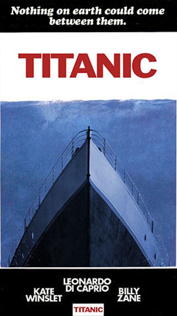
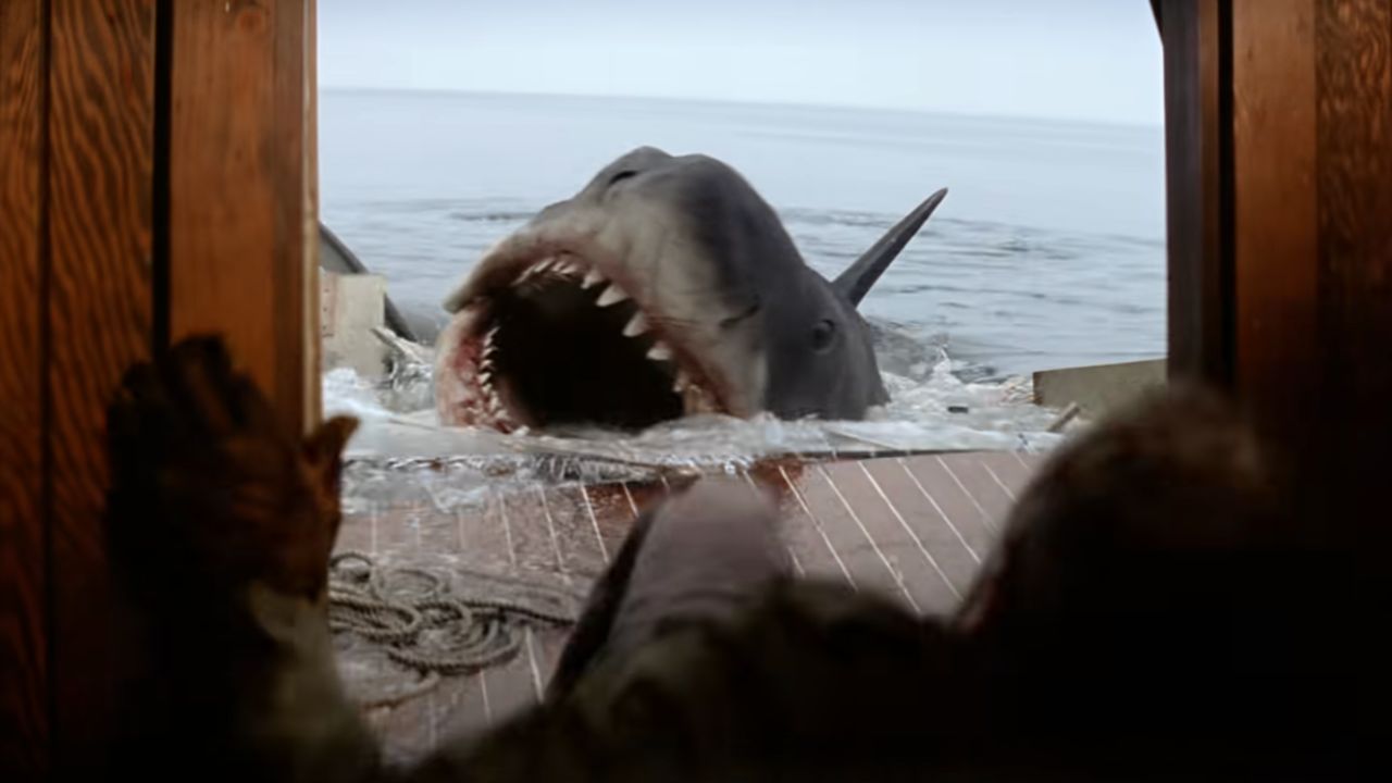
Which brings us to our final image. What happens when you take the former champion of the box office and mix it with a killer shark movie? You've got a script that practically writes itself for the SyFy Channel. Think about it... the Titanic was actually a sentient being with a vendetta on the iceberg that killed its family. It's like The Wrath of Khan, told from Khan's perspective, and with a ship! Okay, so this idea's a little bit much, but if you really think it's that bad, check out the trailer for Bad Johnson below, come back, and say that you really thought that the concept displayed makes more sense than anything shown here.
Otherwise, head over to the Imgur galleries in the links above to see more of those posters. After all, there's a Batman piece hiding in one of those links.

Mike Reyes is the Senior Movie Contributor at CinemaBlend, though that title’s more of a guideline really. Passionate about entertainment since grade school, the movies have always held a special place in his life, which explains his current occupation. Mike graduated from Drew University with a Bachelor’s Degree in Political Science, but swore off of running for public office a long time ago. Mike's expertise ranges from James Bond to everything Alita, making for a brilliantly eclectic resume. He fights for the user.
