Oz The Great And Powerful's Opening Titles: An Exclusive Look Behind The Scenes
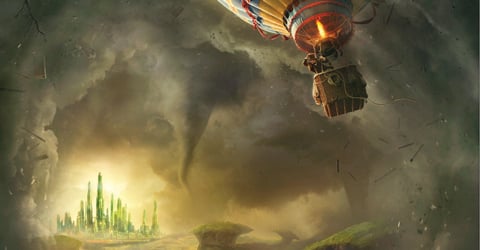
In the opening credits for Oz The Great And Powerful, there's a moment that takes about half a second, and happens only in silhouette, that nearly didn't make the cut. The title sequence, designed by Garson Yu and his Yu + Co to emulate the old-fashioned anaglyph 3D technique, shows James Franco's Oscar traveling into the land of Oz, meeting and dancing with MIla Kunis's Theodora… and briefly, very briefly, throws the silhouette of a witch's hat on the wall behind them.
"That moment is really two frames, on the witch, [but] we had to get clearance on it," says Yu, speaking by phone from his Los Angeles office. Like the rest of the team making Oz The Great And Powerful, Yu had to steer clear of any imagery too closely linked to the 1939 The Wizard of Oz, whose rights are owned by Warner Bros. and MGM, not Disney. But Yu was also in the tricky position of telling the story of Oz, and hinting at surprise developments later on, without spoiling anything to come. The elaborate opening credits in Oz, which are presented in the same limited aspect ratio and sepia tones of the film's early scenes, not only set up the mood of the 1905 Kansas carnival where we first meet Oscar, they suggest the spectacle that comes later in the film-- and contain richer and deeper 3D than anything we'll see until we actually land in Oz.
As Yu explains it, "Our opening sequence needed to set up this sensational 3D journey, up front, so that the audience kind of expects the whole entire film is going to be an adventure fantasy film. We purposely wanted to embrace every single trick in stereo, to make sure that the audience really enjoys the idea of this stereo journey." When his company made the pitch to director Sam Raimi and other members of the production team, everyone had to don old-fashioned red and cyan paper 3D glasses to see the presentation-- even though they had made a film utilizing the most modern 3D techniques possible. "We presented in the most old-fashioned and traditional way, which Sam really appreciated," Yu says. "He has kind of this nostalgic approach to film."
And nostalgia was precisely what Yu was trying to evoke, with his team looking back to the films of Georges Melies for inspiration-- "the first Cinemagician," they call him-- and referencing old circus posters, silent film title cards and even circular "phenakistoscope" panels to create the look of the opening titles. Below you can see their references sheets (click for larger hi-res versions):
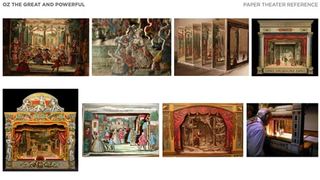
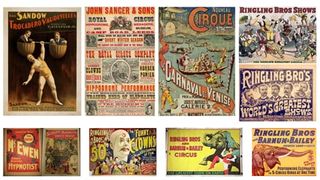

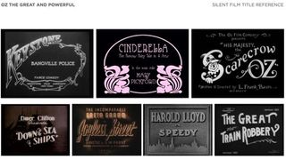
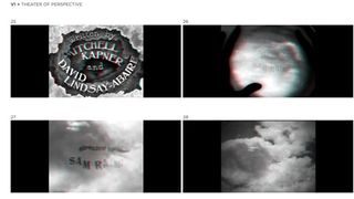
The rules about what Yu could reference from The Wizard of Oz were strict-- even clouds were forbidden from the opening titles because they're in the opening of the original film, leaving him to create "a graphic interpretation of clouds" instead. Still, Yu took inspiration from the way the 1939 film foreshadows much of its action throughout the film. The entire title sequence foreshadows Oscar's journey into Oz, spiraling forward constantly like a trip through a tornado, and operating from one fixed perspective like a man traveling in an unfamiliar world. But there are also smaller, more specific moments, like the appearance of the Zach Braff-voiced monkey Finley, or the music box that Oscar gives Theodora with disastrous consequences. That music box, like many moments in the sequence, required close collaboration between Yu and composer Danny Elfman:
We wanted to introduce the music box. Danny Elfman did a really, really terrific job setting up and using that melody to set up almost a signature melody throughout the entire movie. We set up that signature audio at the beginning, when we see "Twinkle Twinkle Little Star," to set up a sense of wondering. Then we're pulling back and we realize we're in the world of this three-dimensional diorama set of this paper theater, and then we start zooming into the [Disney logo] castle. So every single thing, in terms of the audio and the visuals, they all foreshadow the story from the film.
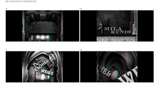
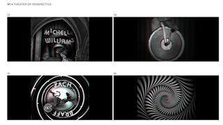
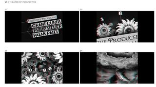
Yu + Co also worked on the closing credits for the film, which take their inspiration from a line in the original Wizard of Oz that they actually were allowed to use: "Pay no attention to the man behind the curtain." Yu's team designed the bright "The End" that flashes across the sky and the sequence that comes after, which like the beginning opens up a curtain, but not on to a paper theater this time. Yu generously shared some of the title design options that didn't wind up in the final film, clearly referencing the antique phenakistoscope cards, though this time in explosive color (and with obviously fake names). See them below (and, again, click for higher-res).

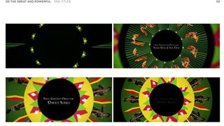
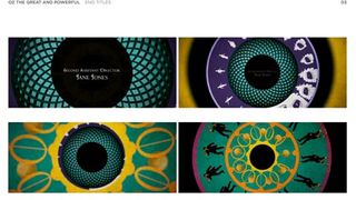
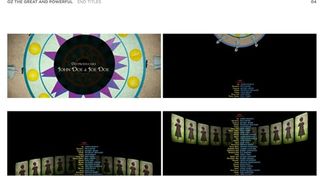
"We have 37 different fonts that we custom made and designed for it," Yu tells me about Oz. Given six months to finish the project, and all of that based on seeing an extremely, extremely rough cut of the film, Yu and his collaborators are put in a nearly impossible position: imagine a key sequence for a film that even the director hasn't thought of. "It's really crazy, but we really enjoy it."
CINEMABLEND NEWSLETTER
Your Daily Blend of Entertainment News
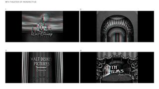
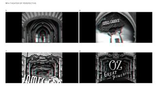
For one last glimpse inside the process of making Oz The Great And Powerful's credits, see a set of unused concept art for the opening titles in the gallery below-- including that contraband cloud imagery under Sam Raimi's name. You can also see the cyan and red outlines on the side that indicate how the 3D effect will be seen using those rudimentary paper glasses. Even though these credits aren't what was used in the film, you can see a lot of elements that carried through to the final product, including the visual strings and sticks to hold up the titles-- intended to evoke an amateur, small-town circus kind of feel-- and the hints at story elements, like the witch silhouette and the unicycle-riding monkey.
Compare them to the actual version of the credits when you catch the film, which is in theaters everywhere now. You can also see Yu's work on the sumptuous opening titles of Life of Pi, plus dozens of other films-- catch up on his full list of credits here.

Staff Writer at CinemaBlend

