madonna
Latest madonna
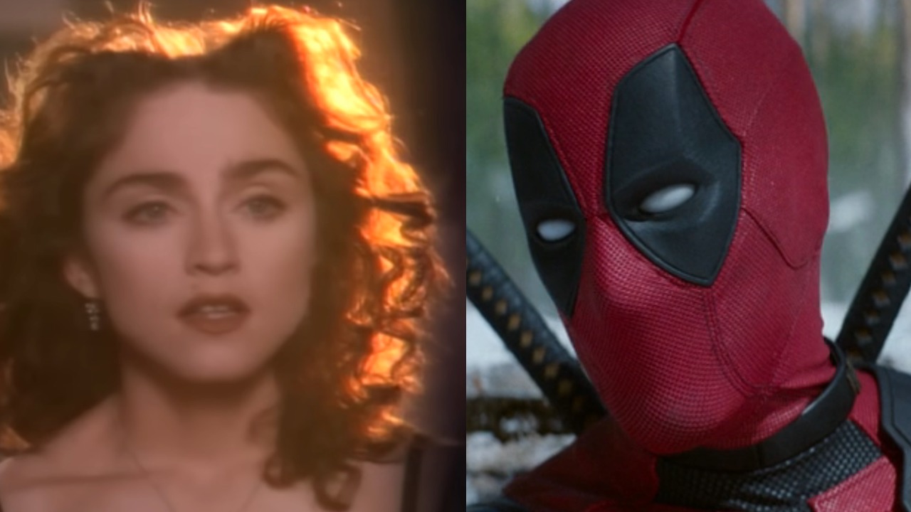
The Cute Way Shawn Levy Responded When Deadpool And Wolverine Bumped Madonna To The Top Of The Charts Again
By Corey Chichizola published
One of Madonna's best songs.

32 Celebrities Who Have Been Married To Multiple Famous People
By Hugh Scott last updated
Hollywood stars sometimes marry each other. Sometimes they marry each other over and over. All of the stars on this list have been married to multiple famous people.

32 Western Entertainers Who Have Made Japanese Commercials
By Hugh Scott published
From cell phones to energy drinks, the stars sell it all in Japan.
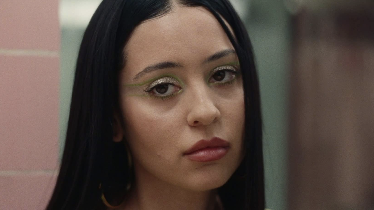
Euphoria’s Alexa Demie Freed The Nipple In Sheer Dress While Appearing In Madonna’s Tour
By Caroline Young published
Euphoria star Alexa Demie hung out with Madonna on stage at the singer's tour and freed the nipple in a bold mesh fashion look.

Ice Baths Are Trending: What Kim Kardashian, Harry Styles And Other Celebrities Have Said About Their Benefits
By Christina Izzo published
From muscle recovery to beauty benefits, here's why A-list celebs like Kim Kardashian, Harry Styles and Lizzo are all about ice baths.
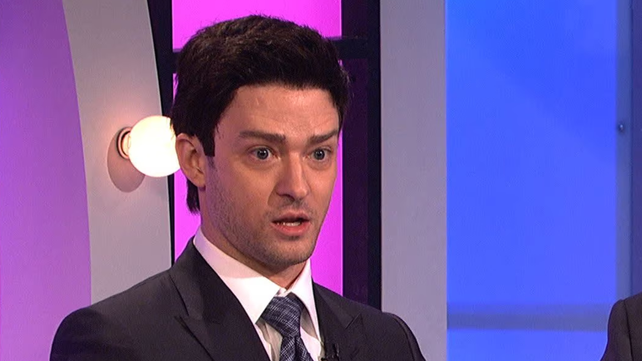
32 SNL Sketches Featuring Famous Musicians
By Jason Wiese published
Saturday Night Live showed that some of our favorite musical artists are not bad comedians either.

32 Celebrities That Have Been Friends Since Before They Were Famous
By Hugh Scott published
Years and years of friendship!
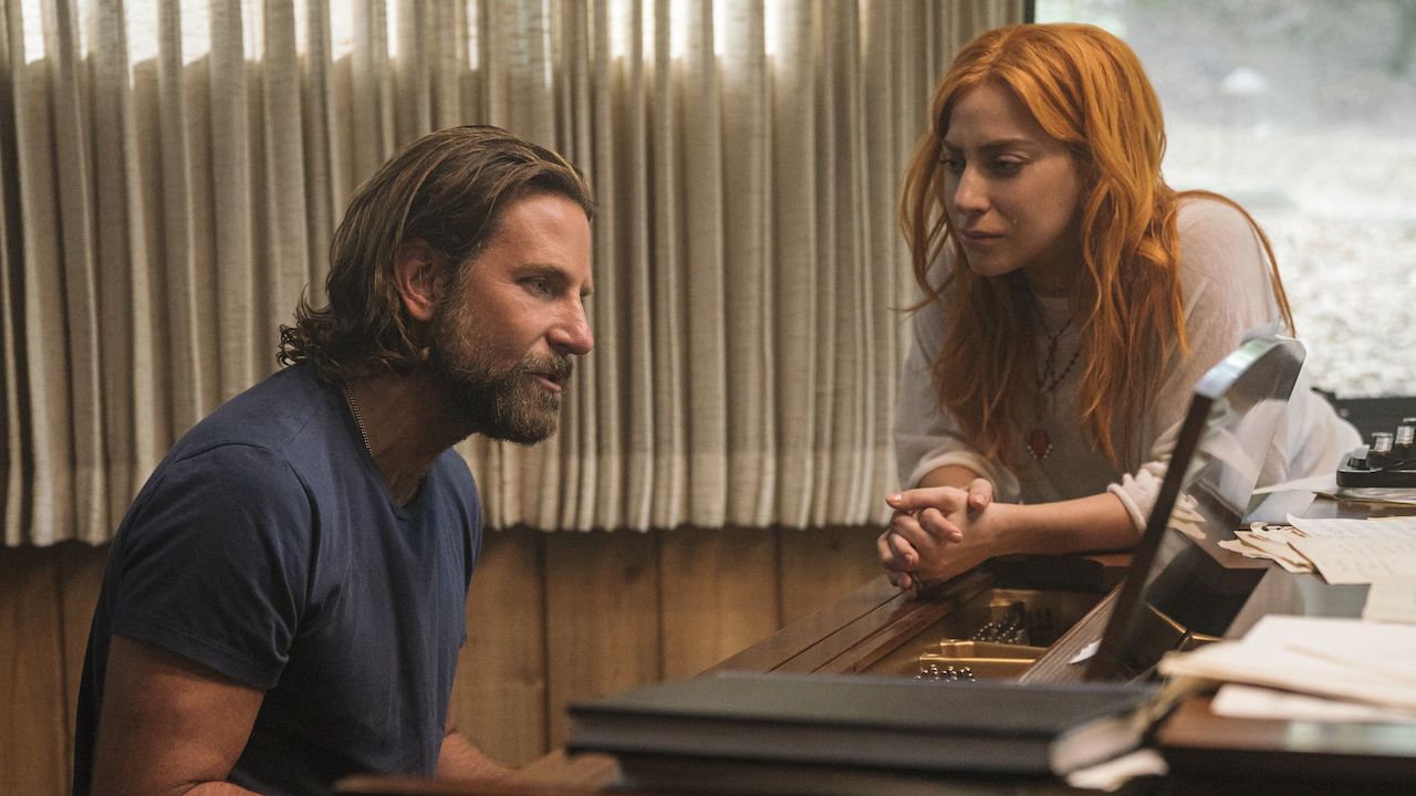
32 Movies Featuring Professional Musicians
By Mike Reyes published
These movies sing, thanks to this professional musicians that stretched their talents into acting.
CINEMABLEND NEWSLETTER
Your Daily Blend of Entertainment News


