If The It Movie's Pennywise Looks This Scary, We're In For Major Nightmares
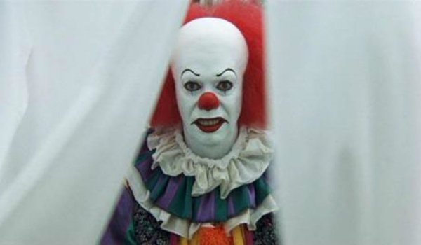
With so many obstacles blocking its way to the goal of production, It is a film that can consider itself lucky to still be in the game. Though the departure of Cary Fukunaga was a pretty big stumbling block for the two-part adaptation of Stephen King's classic novel, Mama director Andres Muschetti was more than game to take up the challenge himself. And judging by this sketch that Muschetti drew of the infamous Pennywise, we're both glad and frightened he's the man for the job. Take a look below, and make sure you're sitting down.
This look at the possible new face of the killer clown from the little town of Derry was shared on Muschetti's Instagram, and we have to say, this is some pretty scary stuff. While it is a ballpoint portrait on the cover of a composition notebook, there's enough detail for the imagination to run wild, particularly with the facial features. You could practically see the blood dripping from the mouth of the clown menace, and his hair style no longer looks like a fright wig. Rather, it looks like a fiery crown of hair that defies gravity, and conventional logic.
It's definitely a concept that's different from the variant previously played by Tim Curry in the 1990 miniseries that aired on ABC. While Stephen King's It looks to be a far cry from Andres Muschetti's It, it's nice to see that the basic concept of Pennywise hasn't changed all that much. If anything, it seems like the character has only been updated for a more cinematic and graphic look for a new age. Now just try to imagine this look on the face of the man who's been recently cast as the new face of fear, Bill Skarsgård, and you can begin to see how well he fits the bill.
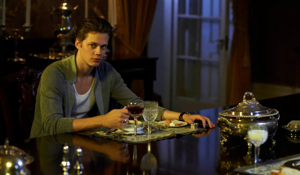
Another interesting thought exercise to consider is comparing Andres Muschetti's look for Pennywise to that of Vincenzo Natali and Amro Attia. While Natali and Attia's concepts for It look like a cross between uber-modern and very grotesque designs, they only serve to draw out the more grounded design that Muschetti has implemented in his sketch at the top. With that image in mind, we can begin to see where It is heading in terms of its tone.
It'd be very easy to turn It into a more modern dissection of fear and horror tropes, and that would still be a pretty exciting film to watch. But judging in his design preference, as well as the fact that Cary Fukunaga carried the torch before him, it looks like the new It will keep the fear in the realm of horror that somehow bridges the border between reality and fantasy. So instead of making what we'll call "Platinum Dunes' It," the second attempt at adapting Stephen King's masterpiece will take inspiration from more subtle influences. It's an approach that we admire, when we're not trying to forget it in order to sleep at night.
It will haunt audiences with its first installment of two on September 8, 2017.
CINEMABLEND NEWSLETTER
Your Daily Blend of Entertainment News
Mike Reyes is the Senior Movie Contributor at CinemaBlend, though that title’s more of a guideline really. Passionate about entertainment since grade school, the movies have always held a special place in his life, which explains his current occupation. Mike graduated from Drew University with a Bachelor’s Degree in Political Science, but swore off of running for public office a long time ago. Mike's expertise ranges from James Bond to everything Alita, making for a brilliantly eclectic resume. He fights for the user.

