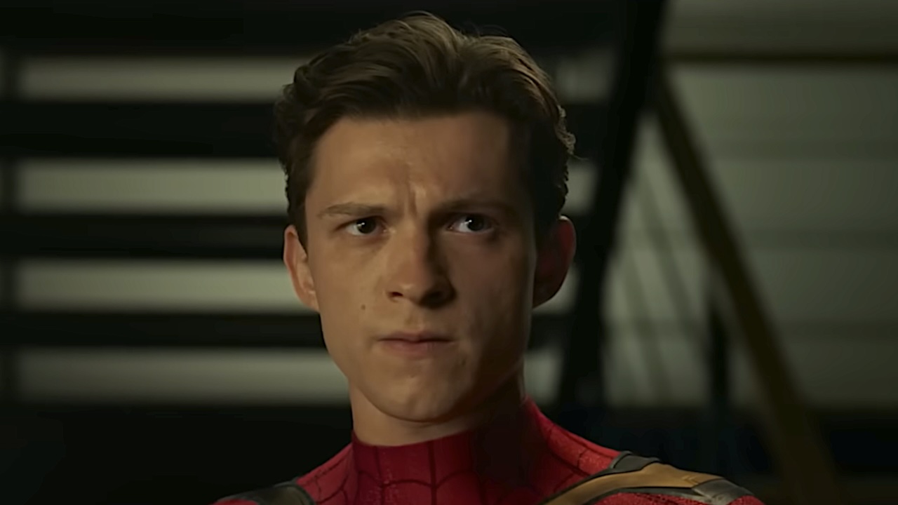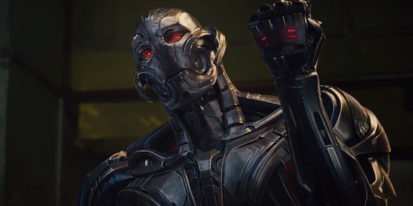
Making a superhero film takes a lot of work, especially when it comes to designing costumes. Concept artists will go through dozens of iterations of a single costume, making both changes large and small before they find one that everyone can agree on. That means that there are usually a bunch of sketches that go unused and for the most part unseen by the public (unless you want to shell out the money for an Art Of book). Sometimes artists are nice enough to show off what could have been, which is the case with some concept art for the final look of the villainous Marvel robot, Ultron. Check it out.
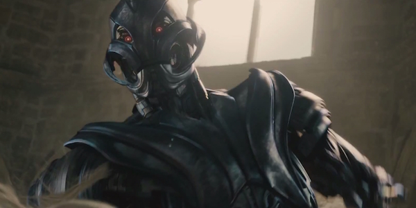
In Avengers: Age of Ultron, the title villain goes through three distinct looks. The first is in his introduction when he crashes the celebration party in a mangled Iron Legion drone. Shortly after he appears as the sleek and expressive Ultron Prime, the form he has for most of the film. Finally, after the Avengers have pissed him off beyond belief, he upgrades to Ultimate Ultron with a body made entirely of vibranium. He's very sharp and menacing and looks almost exactly like Megatron from Transformers. He lost some of what made him unique, which is exactly what this concept art from Josh Nizzi is.
Josh Nizzi's version is very cool and keeps the sharp angles and scariness of Ultimate Ultron, while still being very much on par with the villain's other looks. The notable differences from this form and the film version is in the head and all those extra arms. In the movie, Ultron has a very expressive face, both to capture the emotion of James Spader and because you don't really get invested in a character whose face is just a blank slate with an open mouth. The Nizzi version screams comic book Ultron, but it was probably a good call from the producers to keep the face expressive. Ultron makes some great faces while on screen.
Of course, the other more notable difference is the fact that it's easier for Ultron to start an applause. He's got six arms and it is admittedly both silly and cool. One would wager that the extra arms pop out when he starts fighting and he's got one arm for each Avenger (which only makes me think that the Avengers should have fought him all at once). Apparently, there's concept art of Cyborg in Justice League growing extra arms to fight as well. I guess it's just a robot thing to have lots of arms?
So, what do you all think of this new concept art? Do you want to give it six high fives or did you like the movie version better? Sound off in the comments below.
CINEMABLEND NEWSLETTER
Your Daily Blend of Entertainment News
Matt has lived in New Jersey his entire life, but commutes every day to New York City. He graduated from Rowan University and loves Marvel, Nintendo, and going on long hikes and then greatly wishing he was back indoors. Matt has been covering the entertainment industry for over two years and will fight to his dying breath that Hulk and Black Widow make a good couple.

