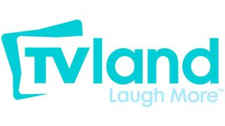
TV Land Changes Logo Following Turn To Scripted Shows

TV Land has been getting into original entertainment over the last several years, with Hot in Cleveland garnering the network some pretty ‘hot’ ratings and a new spinoff series called Soul Man – featuring Cedric the Entertainer – getting picked up. With all of the new content on the network, the color-blocked, blast-from-the-past TV Land logo that had been a mainstay on the network since its arrival in the nineties was beginning to look a little stale.
Apparently, TV Land was getting this vibe, too, because the network has unveiled a brand new logo to go with its also-new “laugh more” tagline. According to THR, the new look is meant to be fresher and updated, but is also meant to reflect the lighthearted, comedic outlook that TV Land has been trying to portray in recent months. Besides unveiling new scripted comedies, the network has also been trying to acquire more syndicated sitcoms to allow the channel to be more of a perpetual laugh factory.

Although I’m not certain I love the blue on blue look of the new logo as it makes me feel I am at a baby shower for a little boy, it is certainly an advancement on the vermilion, mustard yellow, and blue icon TV Land rolled with before. I'm no longer feeling like I’m stepping back into a scene from That ‘70s Show, which is definitely a positive. As TV Land President Larry W. Jones put it, “The logo feels more modern, but it’s not a complete abandonment of what our heritage is.” Sounds just right.
CINEMABLEND NEWSLETTER
Your Daily Blend of Entertainment News
Most Popular


